Preview image. Unlock full-res
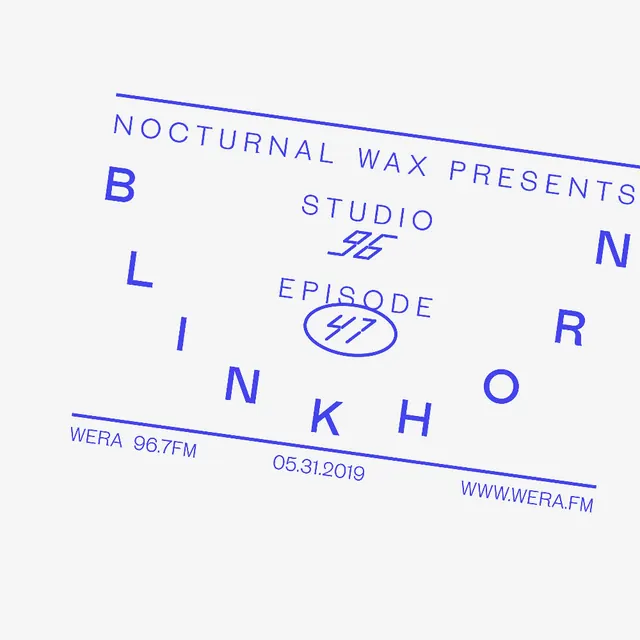
A minimal tilted typographic poster in blue-violet on an off-white field with a thin framed composition and large scattered letters.
Summary
A minimal tilted typographic poster in blue-violet on an off-white field with a thin framed composition and large scattered letters.
Visual description
An off-white poster sits on a clean background and is rotated slightly clockwise. Thin blue-violet rules frame the top and bottom edges, while the main text is arranged in a loose, asymmetrical composition with widely spaced uppercase letters, a central studio mark, and a circled episode number.
Key takeaway
Use a restrained two-color palette with one strong accent and build energy through rotation, spacing, and scattered type rather than imagery. A thin border plus generous empty space gives the layout a crisp, poster-like finish.
Reuse notes
This approach works well for event posters, show identities, and editorial covers where typography needs to carry the whole composition. It is most effective when you want a graphic, minimal system that feels precise rather than decorative.