Preview image. Unlock full-res
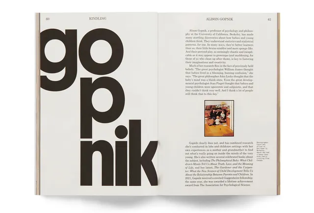
Editorial book page featuring large bold letterforms and editorial text layout with author portrait photograph.
Summary
An editorial book spread showing a two-page layout with oversized display type reading "go pop hik" and body text with an embedded biographical photograph.
Visual description
A clean, minimalist book spread on cream-colored paper. The left page features large, bold black sans-serif typography arranged organically across the page. The right page contains justified body text in a serif font with a small color photograph inset showing people, and a page number at the top. The typography on the left dominates the composition through scale and weight. The overall design is restrained with generous white space, a tan or brown trim visible on the outer edge of the pages.
Key takeaway
Scale and simplicity used to create visual hierarchy in editorial design. Large display type on one page balanced by smaller, justified body text on the opposite page creates rhythm and reader engagement. The minimal use of imagery and color maintains focus on typography and content.
Reuse notes
Strong reference for literary publications, editorials, and book design. The layout technique works well for author biographies, feature articles, or portfolio presentations. The typography-led approach suits premium, editorial contexts. The color palette and restraint are appropriate for cultural institutions, publishing houses, and thought-leadership publications.
More like this
Keep what you find
A free account saves references to boards and can send you a weekly email of picks based on what you save.
To see every result, go Pro.