Preview image. Unlock full-res
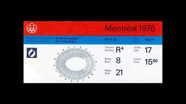
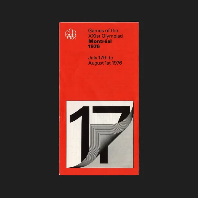
Vintage Olympic poster design with bold geometric numerals and Swiss-style typography on a bright red background.
Summary
A bold 1976 Montreal Olympics poster featuring large geometric numerals with a moiré pattern effect on a striking red background, combined with Swiss-style typography.
Visual description
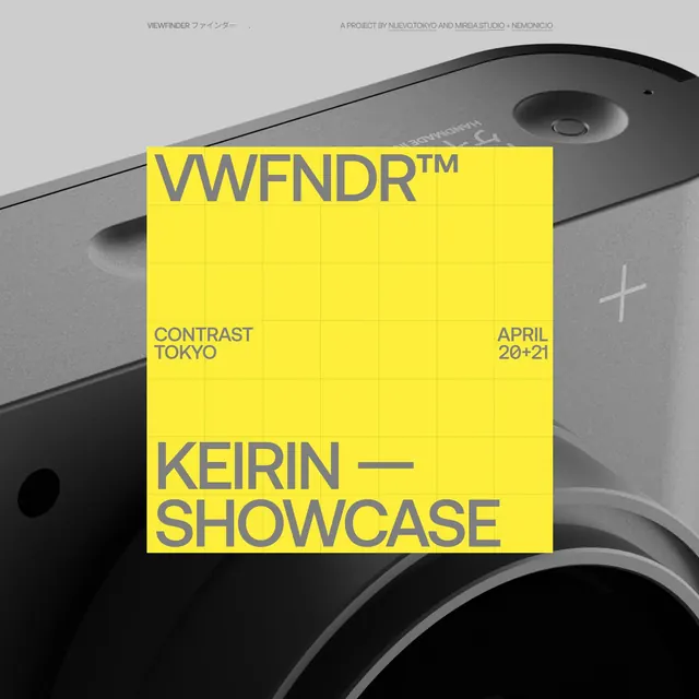
A bright red background contains a centered composition with white text in the upper portion announcing Games of the XXIst Olympiad, Montreal 1976, and the event dates July 17th to August 1st. A white Olympic rings logo appears above the text. The lower portion shows large numerals 17 in bold geometric forms. The 7 features a complex moiré pattern of parallel lines creating an optical vibration effect. A thin white border frames the composition against the dark background. The typography is clean, sans-serif, and geometric, typical of Swiss design language.
Key takeaway
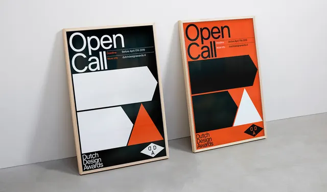
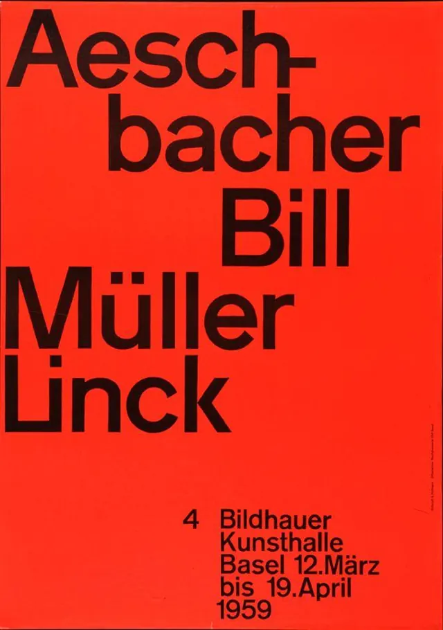
Swiss design principles (geometric forms, limited color palette, clear hierarchy, technical precision) applied to sports branding create timeless authority. The moiré pattern adds visual sophistication and kinetic energy to static type. The high-contrast red and white is immediately legible and memorable. Demonstrates how systematic design thinking produces iconic results that endure decades later.
Reuse notes
Excellent reference for sports branding, event identity, or retro-inspired design systems. The Swiss style and geometric approach remain contemporary while evoking mid-century modernism. Adaptable to various sporting or cultural events. Works well for poster design, social media campaigns, or exhibition materials. The moiré pattern technique is effective for adding complexity without ornamentation. Strong for heritage brands or retrospective design exercises celebrating historical design excellence.