Preview image. Unlock full-res
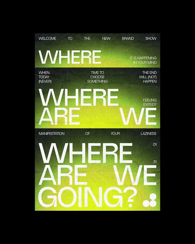
A typographic poster stacking three size-escalating repetitions of the phrase 'Where Are We Going?' in white bold sans-serif over a lime-green halftone gradient on near-black, with small column text filling the gutters.
Summary
Typographic poster for "The New Brand Show" structured as three stacked bands of white all-caps bold sans-serif -- "WHERE," "WHERE ARE WE," and "WHERE ARE WE GOING?" -- increasing in scale from top to bottom, printed over a lime-green halftone radial gradient on a near-black field.
Visual description
Portrait poster on a black background. The composition is divided into three roughly equal horizontal bands, each anchored by a white all-caps headline in a wide, heavy geometric sans-serif: top band reads "WHERE" at medium display size; middle band reads "WHERE ARE WE" slightly larger; bottom band reads "WHERE ARE WE GOING?" at the largest size, filling the full width. The lime-yellow-green halftone radiates from the center of each band, creating a soft spotlight glow that fades to near-black at the edges. Between and alongside the large headlines, small columns of white all-caps body copy fill the gutters in a strict grid -- "WELCOME TO THE NEW BRAND SHOW" runs above the first band; "WHEN: TODAY (NEVER) / TIME TO CHOOSE SOMETHING / THE END WILL (NOT) HAPPEN" sits in three columns between bands one and two; "MANIFESTATION OF YOUR LAZINESS" in three columns between bands two and three. A small issue number "01" and "31" appear as marginal annotations. A small pixel/emoji icon sits at bottom right.
Key takeaway
The three-tier escalating-scale repeat of the same text -- growing from a fragment to a full question -- is a powerful narrative-poster device that builds tension through accumulation. The halftone radial gradient behind each tier functions as a spotlight, keeping the flat black ground dynamic without adding imagery. Small-caps column text used as pure texture in the gutters creates an editorial newspaper feeling while adding information density at no visual cost.
Reuse notes
Strong reference for event or conference posters, brand launch announcements, or art/culture publications that want a brutalist-editorial voice. The lime-on-black palette is arresting but limits color flexibility -- ensure pairing context is dark. The halftone texture lends itself to risograph or screenprint aesthetics, making it a good reference when a printed artifact look is desired on screen.
More like this
Keep what you find
A free account saves references to boards and can send you a weekly email of picks based on what you save.
To see every result, go Pro.