Preview image. Unlock full-res
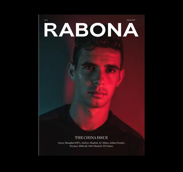
Editorial magazine cover featuring a portrait split with complementary red and teal gradient lighting, bold white headline, and minimalist typography.
Summary
A magazine cover for Rabona split into two asymmetric color zones—warm red on the right, cool teal on the left—with a portrait face split down the middle receiving matching gradient lighting, plus bold white all-caps headline and subtitle centered in serif type.
Visual description
Portrait of a man's face split vertically by complementary lighting: warm red flooding the right half, cool blue-teal on the left. Large white "RABONA" headline centered above, with "THE CHINA ISSUE" and credits in refined serif below. Dark navy/black background. Clean separation between color zones, creating high drama through colored lighting rather than post-production color grading. Issue number and date in top corners.
Key takeaway
Using complementary colored lighting (not grading) to create visual impact and drama in a portrait, paired with generous white space and heavyweight typography to communicate editorial prestige.
Reuse notes
Perfect reference for high-end fashion or culture magazine covers that want bold color drama without feeling artificial. The split-lighting technique works especially well when the portrait can handle dramatic side lighting.