Preview image. Unlock full-res
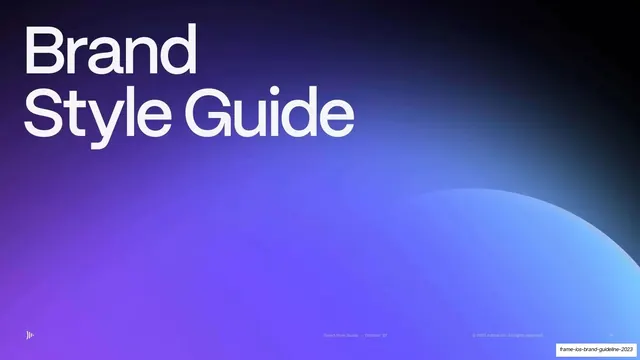
An 18-slide brand style guide for Frame.io that pairs stark black utility slides with cobalt-to-coral gradient interludes, big lowercase grotesque section titles, and cinematic dark photography.
Summary
An 18-slide brand style guide for Frame.io, the video collaboration platform. Its identity rests on a hard contrast between near-black utility slides and saturated cobalt-to-coral gradient slides, with oversized lowercase grotesque section titles and consistently cinematic, low-key photography.
Visual description
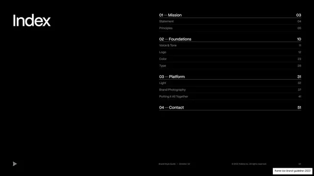
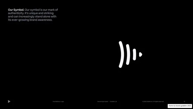
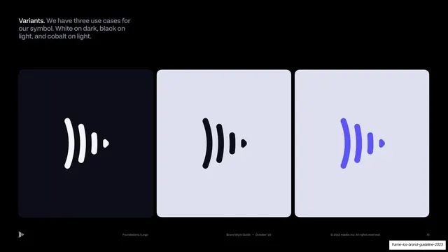
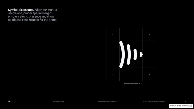
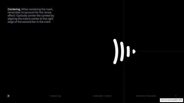
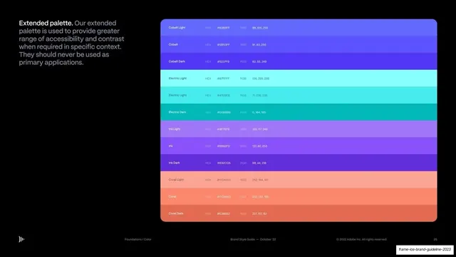
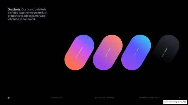
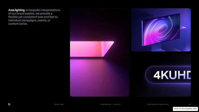
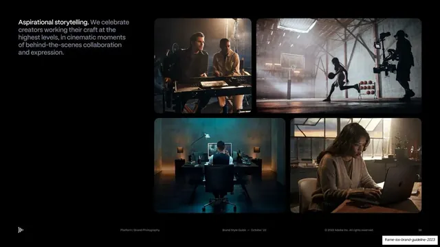
Slides are 16:9 on a near-black field. Two slide species alternate: dense black informational slides (logo rules, color tables, photo grids) and full-bleed atmospheric gradient slides used as section openers, blending cobalt blue, violet, magenta and coral. Section-title slides set a single oversized lowercase grotesque word ("Mission", "Foundations") top-left over a dark gradient. Body slides use a recurring text pattern: a bold white lead-in word ("Undeniable.", "Premium.", "Our Symbol.", "Gradients.") followed by muted grey sans-serif running copy, parked in the top-left column. A persistent running header/footer system carries the sound-wave brand mark bottom-left, a left section breadcrumb ("Foundations / Logo", "Platform / Light"), a centered "Brand Style Guide, October '22" label, a right copyright line, and a page number far-right, all in tiny grey type. Content slides cover the brand mark (a rounded sound-wave glyph) with its three color variants (white on dark, black on light, cobalt on light), clearspace and optical-centering diagrams, a primary and an extended color table with HEX and RGB values, a named gradient set (Santa Monica, Tribeca, Miami, Gotham), grids of soft gradient "light" blobs, and several full-bleed cinematic photographs of creators in dark edit bays and on film sets.
Key takeaway
The alternation between austere black information slides and lush gradient section breaks, which lets a dry brand-guide breathe. The lead-in-word-plus-grey-body text pattern that makes every slide scannable in one glance. And the disciplined running header/footer with breadcrumb, mark, label and page number that quietly threads the whole document together.
Reuse notes
A strong reference for brand guidelines, design-system documentation, and any dark, premium product deck, especially in media, video, or developer tooling. The logo-usage, clearspace, centering, color-table and gradient-system slides are directly reusable as a guideline template. The cobalt-to-coral gradient language and cinematic low-key photography are core to the feel and need genuine assets to carry; on a thin photo library the gradient slides do the heavy lifting.