Preview image. Unlock full-res
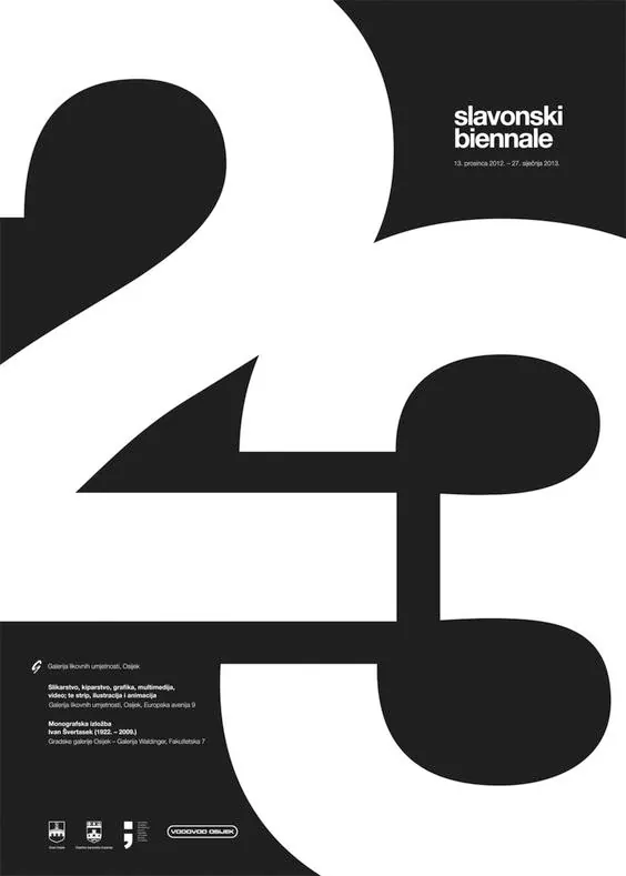
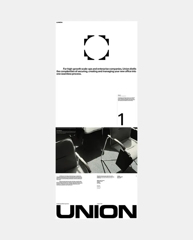
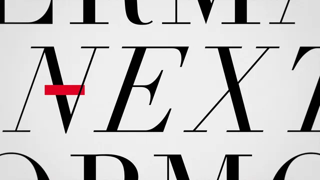
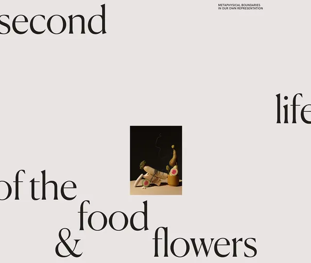
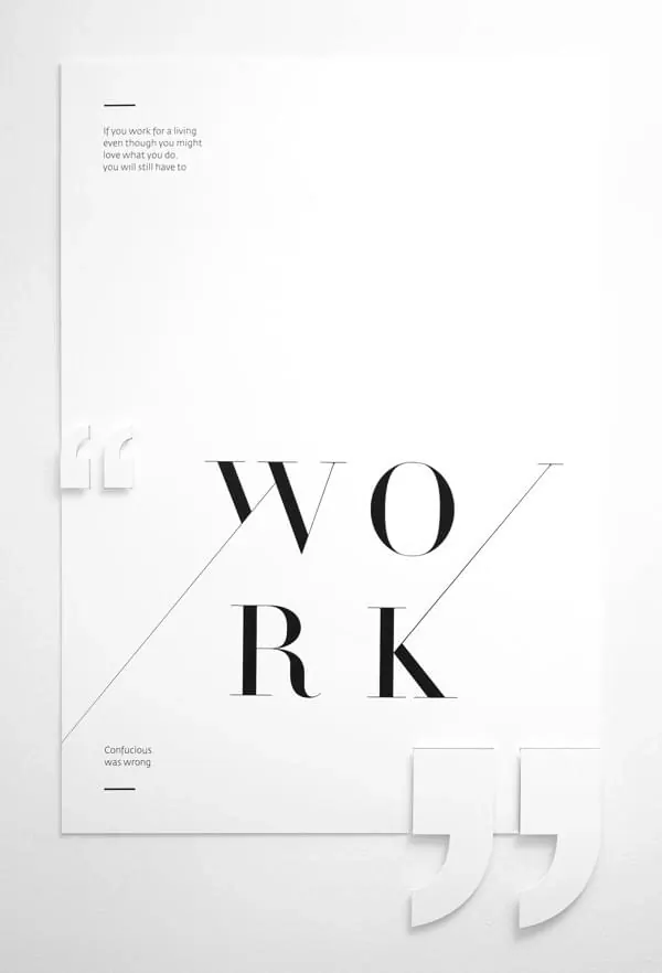
A minimalist poster design featuring oversized serif typography spelling 'WORK' with asymmetric supporting text and thin line dividers on a light background.
Summary
A typographic poster layout using large serif letters arranged vertically (W, O, R, K on separate lines) with supporting blocks of smaller text, thin horizontal lines, and asymmetric spacing to create visual hierarchy and rhythm.
Visual description
Off-white background. Large black serif letters stacked vertically in the center, with diagonal line framing around them. Smaller gray text blocks sit above and below the main text—one left-aligned with a quote, another centered near the bottom. Thin horizontal rules separate sections. The composition balances centered and left-aligned elements, and the proportions create a sense of organized complexity within the minimal palette.
Key takeaway
Big typography can be an organizational system, not just decoration. The serif letter forms dominate, but supporting text hierarchy and line-work provide structure and guide reading. Asymmetry within symmetry creates visual interest.
Reuse notes
A reference for editorial design, typography-heavy posters, or Swiss-style grid-based layouts. The blocking and scale relationships work for motivational graphics, design books, or educational materials. The serif letterforms feel classic and legible at any size.