Preview image. Unlock full-res
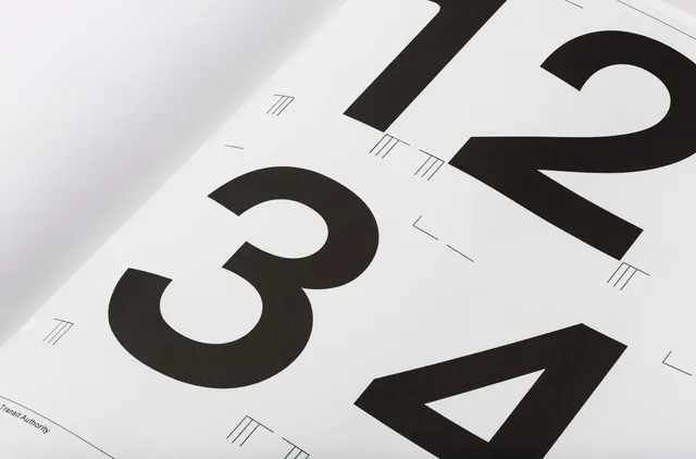
Close-up photograph of a printed standards manual page showing bold numerals 1, 2, 3, 4 with typographic construction marks on white paper.
Summary
A printed standards manual page from the NYC Transit Authority showing large bold sans-serif numerals with construction and registration marks overlaid on white paper.
Visual description
Angled close-up photograph of a white paper page featuring bold black numerals (1, 2, 3, 4) printed in a heavy sans-serif typeface. Small geometric construction marks—parallel lines, right angles, and reference guides—are hand-drawn or printed in thin lines across the numerals, indicating typographic measurement points and alignment guides. The high-contrast monochromatic palette emphasizes the precision and technical nature of the design system documentation.
Key takeaway
Standards manuals use construction marks and reference grids to show how typefaces are metered and constructed. Documenting the geometry of letter forms makes typography reproducible and systematic.
Reuse notes
Excellent reference for type system documentation, design system guides, and technical typography presentations. The construction-mark approach works well for displaying font metrics, kerning pairs, and modular letterform grids. Evokes classic design system rigor and systematic thinking.
More like this

Keep what you find
A free account saves references to boards and can send you a weekly email of picks based on what you save.
To see every result, go Pro.