Preview image. Unlock full-res
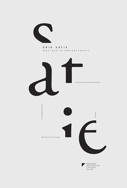
Minimalist typographic poster for Erik Satie featuring large, irregularly-spaced display lettering on a light background with small descriptive text.
Summary
A Swiss-style typographic poster for Erik Satie featuring large, irregularly-stacked sans-serif letters in black against a light gray background, with minimal supporting text.
Visual description
The poster uses a light gray background with bold black sans-serif typography. Large display letters spell out "satie" in an unconventional arrangement—stacked vertically and horizontally across the canvas with varying sizes and positions. Small text reads "ERIK SATIE" and "musique d'ameublement" near the top, with additional credits and information in smaller type scattered throughout the composition. The overall effect is austere and modern.
Key takeaway
Irregular, asymmetric letter placement can create dynamic visual interest while maintaining a sophisticated, minimal aesthetic through limited color and generous white space.
Reuse notes
Strong reference for typographic posters, music event promotion, or any design needing to balance minimal color with bold letterform composition and playful spatial arrangement.
More like this
Keep what you find
A free account saves references to boards and can send you a weekly email of picks based on what you save.
To see every result, go Pro.