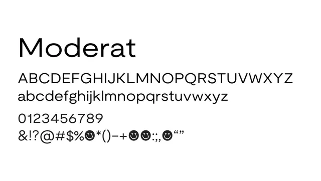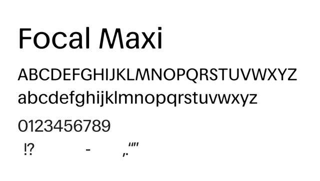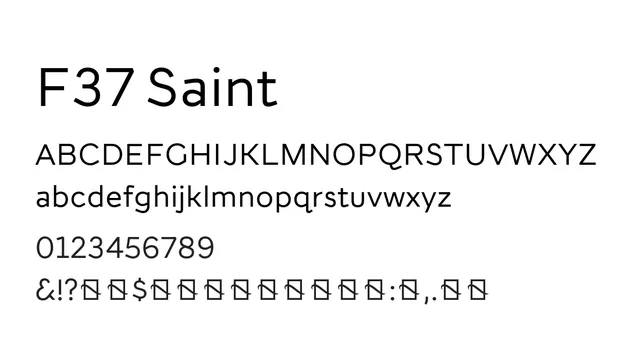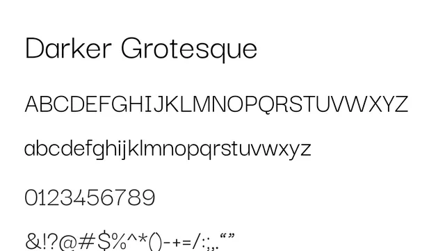
Preview image. Unlock full-res
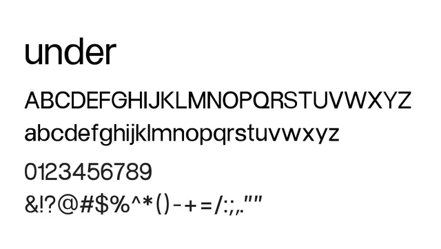
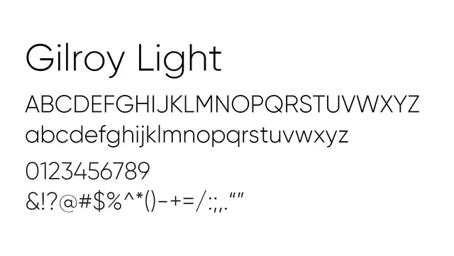
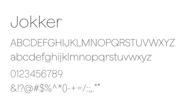
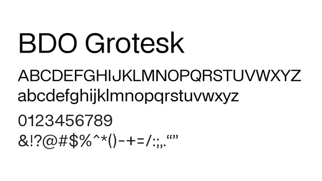
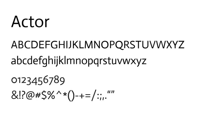
A refined neo-grotesque with generous spacing and elegant proportions—perfect for professional, readable interfaces and body text.
Styleclean, professional, neutral, elegant
Typesans-serif, neo-grotesque
Moodcalm, refined, trustworthy, sophisticated
Industrycorporate, editorial, saas, fintech, professional-services
Summary
A refined neo-grotesque with generous spacing and elegant proportions—perfect for professional, readable interfaces and body text.
What to use it for
Actor excels as a primary typeface in editorial and corporate contexts. Its clean, legible forms work well for web body text, UI labels, and professional presentations.
Pairing
Pair Actor with a serif like Lora for contrast, or use with a geometric display font like Poppins for headlines.