Preview image. Unlock full-res
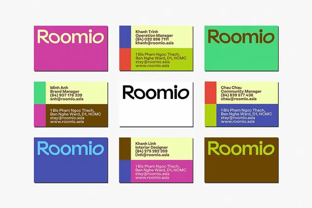
A 3x3 grid of color-blocked employee cards in contrasting solids (magenta, teal, lime, blue, brown, green) with the Roomio wordmark and contact details, each card splitting into two complementary color fields.
Summary
A 3x3 grid of personnel cards for the Roomio hospitality brand, each card split diagonally or horizontally into two solid complementary colors (magenta-lime, teal-coral, blue-olive, etc.) with the wordmark or employee name and contact info centered on a 1-2 color field in clean sans-serif type.
Visual description
Nine rectangular cards arranged in a three-by-three grid on a light background. Each card pairs one of six colors (bright magenta, teal, lime-green, cornflower-blue, brown-ochre, dark green) with white or a contrasting second color, with clear black borders. Cards are split vertically or horizontally: some display the Roomio wordmark in white or colored type alone, others show a person's name, title, phone, and email in black sans-serif over a lime or light background. The layout is strictly modular, with equal card widths and consistent gutters.
Key takeaway
The modular, color-blocked approach to team rosters: assigning a unique dual-tone palette per person or role makes the grid visually distinct and memorable while staying highly readable. The contrast between solid backgrounds and thin black borders keeps the design crisp. Diagonal color splits on some cards break the horizontal monotony without adding complexity.
Reuse notes
Strong for team directories, staff rosters, or organizational charts where each entry needs visual distinction. Works well for hospitality, event planning, or service companies where personality and accessibility matter. Color pairs should have sufficient contrast for legibility of overlaid text.
More like this




Keep what you find
A free account saves references to boards and can send you a weekly email of picks based on what you save.
To see every result, go Pro.