Preview image. Unlock full-res
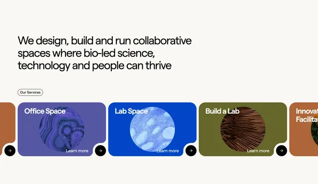
Service carousel with four deeply-rounded cards in bold color blocks, each overlaid with a distinct abstract circular texture and white 'Learn more' text.
Summary
Service carousel with four deeply-rounded cards in bold color blocks, each overlaid with a distinct abstract circular texture and white 'Learn more' text.
Visual description
A light cream background anchors a dominant headline above a horizontal carousel of four equally-weighted cards. Each card uses a large border-radius and distinct solid color: deep purple, bright blue, olive green, and burnt orange, each extending partially off-canvas to indicate scrollability. Each card bears a centered white-filled circular shape containing a unique abstract texture (concentric rings, wavy patterns, wood grain, marble effect). White sans-serif labels name each service (Office Space, Lab Space, Build a Lab, Innovation Facility) with a 'Learn more' link and right-pointing arrow navigation circles at baseline.
Key takeaway
The deeply-rounded cards feel modern and tactile. Each abstract texture is distinct enough to differentiate services at a glance. Color blocking creates immediate category separation without additional typography hierarchy. Navigation arrows paired with card peeking suggest a carousel without relying on obvious slide indicators.
Reuse notes
Works well for facility management, biotech, collaborative-space marketing, and service category showcases. The abstract textures suggest science and innovation without being literal. Pairs well with bold, confident brands. The color palette can be swapped while maintaining the hierarchy of card size and texture distinctiveness.
More like this






Keep what you find
A free account saves references to boards and can send you a weekly email of picks based on what you save.
To see every result, go Pro.