Preview image. Unlock full-res
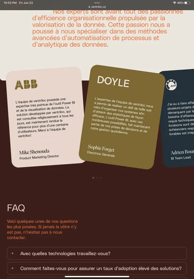
Corporate case study layout featuring overlapping testimonial cards in warm olive and tan tones, with FAQ accordion below.
Summary
Corporate case study page with three overlapping testimonial cards (ABB, Doyle, and others) printed on warm olive/tan labels, followed by an FAQ section with collapsible questions.
Visual description
Header text in coral-orange describes the organization's data expertise and methodology. Below, three staggered business-card-style testimonials in sage olive and cream tan, each with a company logo (ABB, Doyle), person name, and job title. The cards overlap slightly at a diagonal for dynamic composition. A "FAQ" heading in white text on dark brown introduces an accordion-style section with two visible expandable questions about technology and adoption rates. Typography is clean sans-serif in white, cream, and dark brown throughout. The overall background is dark brown/charcoal.
Key takeaway
The offset card stack as a tactile testimonial vehicle—feels physical and collectible rather than a flat grid. The warm two-color palette (olive/cream) against dark brown creates warmth and approachability without bright color. The accordion FAQ below the social proof is a natural progressive-disclosure pattern for B2B skepticism.
Reuse notes
Effective for B2B case studies, consulting, or services pages where you need to show multiple partner logos and brief third-party endorsements. Works well when the audience values trust signals. The warm palette reads as sophisticated and editorial rather than tech-forward.
More like this



Keep what you find
A free account saves references to boards and can send you a weekly email of picks based on what you save.
To see every result, go Pro.