Preview image. Unlock full-res
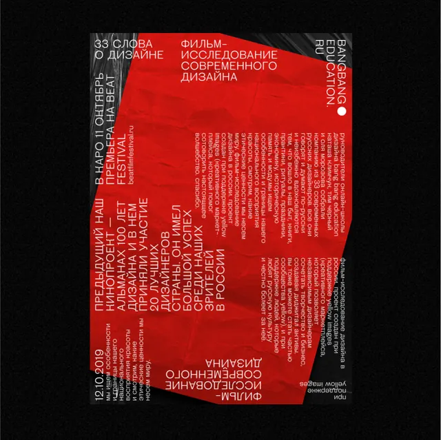
High-contrast typographic poster combining bold red text and shapes against deep black, layered in organic, asymmetric composition to create visual intensity.
Summary
A bold typographic poster built from stacked, overlapping sans-serif display type in bright red and pure black, treating text as raw visual form to command attention.
Visual description
The composition fills the frame with large sans-serif letterforms and words arranged in organic blocks, some rotated or scaled at different angles. Red text and shapes dominate the upper and middle sections against a black background, while the lower half introduces gray type layered behind, creating depth. No clear readable narrative is present; the focus is on type scale, weight contrast, and the interplay of positive/negative space. The overall effect is urgent and formal, evoking academic publication design or experimental poster work.
Key takeaway
Using display type as both message and form, with dramatic color contrast (red and black) to create visual hierarchy without decoration. The asymmetric arrangement of large letterforms creates dynamism while maintaining clarity through scale difference. Layering type at different opacities and angles adds dimensionality without clutter.
Reuse notes
Strong for experimental posters, academic conferences, or design system specimens. The color palette is punchy but limited, making it easy to adapt. Avoid using for soft, approachable messaging; the intensity reads as serious, formal, or even confrontational by design.
More like this



Keep what you find
A free account saves references to boards and can send you a weekly email of picks based on what you save.
To see every result, go Pro.