Preview image. Unlock full-res
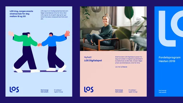
A tripartite campaign layout combining flat vector illustration of two figures collaborating, a professional portrait photograph, and bold blue branding for a Norwegian energy utility.
Summary
A multi-panel Norwegian digital campaign for Los energy company, blending flat collaborative illustration, real photography, and bold blue typography to position the brand as modern and people-focused.
Visual description
Three adjacent rectangular panels on a dark navy background. Left panel (light blue): flat vector illustration of two figures in profile shaking hands, one wearing bright green, the other wearing deep blue, with warm peachy skin tones. Headline text in Norwegian reads "LOS Ung, norges eneste stramavtale for deg mellom 18 og 30!" Below is a Los logo and tagline. Middle panel (soft peachy): a photograph of a woman seated in a modern chair with plants in background, wearing green. Overlaid text says "Nyhet!" and describes "LOS Digitalspot." Right panel (bright pure blue): a large white "LOS" lettermark wordmark ("L" plus "g" symbol) dominates. Smaller text reads "Fordelsprogram Høsten 2019." Each panel uses white sans-serif type. The color palette alternates between cool blue, warm peachy-pink, and illustration color-blocking.
Key takeaway
Combining flat illustration with real photography in distinct panels creates a sense of movement and variety while staying cohesive through color and typography. The light blue, peachy, and bold-blue color progression is memorable and works at screen scale. Flat illustration of people collaborating reinforces partnership messaging without looking dated.
Reuse notes
Works for corporate campaigns announcing new programs or services, energy/utilities sector messaging, or campaigns targeting a specific demographic (youth, first-time customers). The three-panel structure reads left-to-right and works for web and print. Ensure photography subjects are relatable to the target audience.
More like this



Keep what you find
A free account saves references to boards and can send you a weekly email of picks based on what you save.
To see every result, go Pro.