Preview image. Unlock full-res
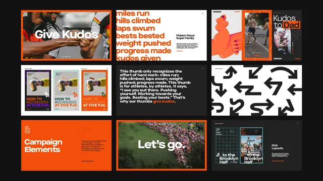
Grid of nine promotional tiles mixing type-driven layouts with photography and iconography, unified by orange, black, and white contrast.
Summary
A three-by-three grid campaign mixing photography, typography, and icons in orange, black, and white, built for fitness or achievement-driven messaging.
Visual description
Modular grid with nine distinct sections showing varied layouts: image-plus-headline pairs (top-left photography with "Give Kudos" overlay text), serif-heavy type stacks with orange accents, photographic testimonial tiles labeled with names, minimalist icon systems in negative space, solid orange call-to-action blocks, landscape photography with centered white headlines, and technical grid diagrams. All sections maintain strict edge-to-edge framing with bold borders, creating rhythm through formal constraint. Typography mixes bold sans-serif for headlines with lighter weights for body; orange is applied consistently as accent, background, and border element to unify the scheme.
Key takeaway
The modular grid approach lets each tile tell its own story without layout repetition; the three-color palette (orange, black, white) drives consistency across wildly different content types; the technique of using orange as both background and accent mark prevents visual chaos despite high variety.
Reuse notes
Strong pattern for fitness apps, achievement platforms, or any consumer app celebrating user accomplishments. Works at web scale or printed at poster size. The orange-on-black combination is vibrant without being inaccessible; white reverse text remains legible. Avoid if your brand is muted or luxury-positioned.
More like this




Keep what you find
A free account saves references to boards and can send you a weekly email of picks based on what you save.
To see every result, go Pro.