Preview image. Unlock full-res
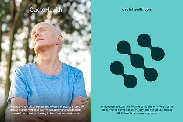
Medical brand identity split between a warm-toned patient portrait on the left and a cool turquoise panel with abstract cellular shapes on the right.
Summary
A split-screen healthcare brand identity pairing a warm-lit patient portrait with clinical typography on the left, and an abstract cluster of teal cellular shapes symbolizing medical science on the right.
Visual description
Two-column layout with clear visual hierarchy. Left panel: an outdoor portrait of an elderly person gazing upward, warm natural light, with body copy describing lymphedema and cancer treatment outcomes in small sans-serif text below. Right panel: bright turquoise/mint background with six dark teal circles arranged in an informal cluster (evoking molecules or cells). Branding ("CactoHealth") and URL appear at the top spanning both panels in clean sans-serif. The contrast between warm portraiture (human, accessible) and cool abstract symbols (scientific, systematic) signals both empathy and expertise.
Key takeaway
Humans + abstract science side-by-side builds trust faster than either alone. The warm-cool color dialogue (skin tone against turquoise) is energizing without being jarring. Small body copy on the portrait side anchors the client story while abstract geometry on the right suggests innovation.
Reuse notes
Effective for medical nonprofits, biotech, pharmaceutical, or wellness brands targeting both patients and practitioners. The split-screen format works well in presentations, landing pages, or brand guidelines. Keep the copy restrained and the abstract shapes clean so neither side dominates visually.
More like this




Keep what you find
A free account saves references to boards and can send you a weekly email of picks based on what you save.
To see every result, go Pro.