Preview image. Unlock full-res
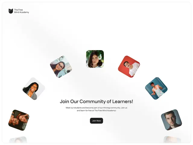
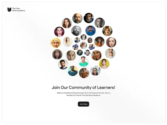
Signup section for an online academy featuring rotated portrait photos scattered around a central headline and form, building community identity.
Summary
Signup section for an online academy featuring rotated portrait photos scattered around a central headline and form, building community identity.
Visual description
White background section for The Free Mind Academy. Small black logo in top-left. Seven square portrait photos (diverse faces, varied skin tones) are rotated 15-25 degrees and scattered informally around the page, arranged in a loose circular pattern: one light-blue-background portrait upper-left, pink-background portrait upper-right, teal-background portrait bottom-right, dark-background portrait bottom-left, center-top a natural-background portrait, and two more colored backgrounds filling gaps. Center of composition: headline "Join Our Community of Learners!" in dark sans-serif, followed by two lines of body copy in smaller type. Below text: black button labeled "Join Now." Portrait photos have soft corners or rounded-square treatment. The rotated informal arrangement of profile images surrounding the call-to-action creates a friendly, inclusive feeling of community membership rather than a sterile form field.
Key takeaway
Rotating portrait photos 15-25 degrees and scattering them breaks the grid in a way that feels personal and inclusive, not chaotic. Placing them around (not behind or overlapping) the CTA keeps the form readable. The diverse faces and varied background colors signal inclusivity without needing text. White breathing room prevents crowding even with 7+ images on screen.
Reuse notes
Excellent for educational platforms, community-driven apps, and membership organizations. The informal arrangement reads warmer than aligned grids, making it feel like "join real people" not "join a platform." Works best when you have diverse portrait photography and a clear, short CTA. Can feel cluttered if images are too large or numerous; 5-9 photos is the sweet spot. Pair with friendly, welcoming copy and avoid all-caps or corporate tone.
More like this


Keep what you find
A free account saves references to boards and can send you a weekly email of picks based on what you save.
To see every result, go Pro.