Preview image. Unlock full-res
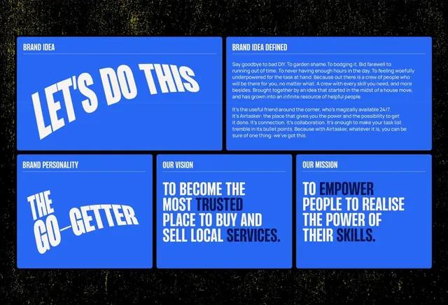
Four-panel grid of bright-blue cards with white display type showcasing brand personality, mission, vision, and values statements.
Summary
A four-panel brand-system display on a speckled dark background with electric-blue cards presenting brand personality, mission, vision, and values in large white display type.
Visual description
Composition arranged in a 2x2 grid on a dark speckled background. Top-left panel: bright blue card with all-caps white sans-serif reading "LET'S DO THIS" (casual, action-oriented). Top-right panel: wider blue card with smaller white body text below "BRAND IDEA DEFINED" headline (smaller type approximately 6-8 lines). Bottom-left: blue card with "THE GO-GETTER" in large white display type, filled the full card width (personality statement). Bottom-right divided into two narrow stacked cards: top reads "TO BECOME THE MOST TRUSTED PLACE TO BUY AND SELL LOCAL SERVICES" (vision, all-caps, large), bottom reads "TO EMPOWER PEOPLE TO REALISE THE POWER OF THEIR SKILLS" (mission, all-caps, large). All type is sans-serif, bold weight, white on mid-blue (#2867F4) backgrounds with high contrast. The geometric grid structure, dark background, and consistent typography create a cohesive, determinate brand narrative.
Key takeaway
The directness of pairing brand concept labels (personality, mission, vision, values) in a scannable grid makes brand systems immediately readable and memorable. Using oversized display type on saturated blue creates boldness and confidence without additional design ornament. The speckled dark background adds texture and sophistication without competing with the typography.
Reuse notes
Works well for B2B service businesses, consulting firms, or coaching/marketplace platforms that need to communicate strong brand purpose at a glance. The all-caps display type is assertive; best paired with detailed mission/vision narratives elsewhere on site. The electric blue reads as contemporary and tech-forward; tone matches service-based or consulting industries more than e-commerce or lifestyle brands.
More like this
Keep what you find
A free account saves references to boards and can send you a weekly email of picks based on what you save.
To see every result, go Pro.