Preview image. Unlock full-res
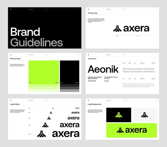
Tech brand guidelines spanning logo scaling, primary color palette, typography system, and background usage for the Axera identity.
Summary
A structured brand guideline system for Axera showing logo, primary color palette, typography, and background applications with high geometric precision and lime-green accent.
Visual description
Six gridded guideline pages laid out as a 2x3 gallery: a dark left panel introduces the brand name in large white sans-serif, a Primary Logo page shows the monogram mark with lockup variations, Primary Colour displays the neon lime green and pure black core palette with hex values and gray neutrals, Typography presents the display serif paired with body copy and specimen text, Logo Scaling shows six proportional size scales of the geometric mark, and Logo Backgrounds demonstrates the mark inverted on black and composed on the bright green bar. Each panel maintains consistent header styling and white space. The palette is stark: black, white, charcoal gray, and one aggressive neon lime-green accent.
Key takeaway
The pairing of maximum contrast (black/white) with a single electric accent color that punches through entire compositions. The grid-based layout for presenting multiple brand assets side by side without visual clutter. The scaled logo renderings showing both mark and lockup at multiple sizes, a standard practice for web/print guidance.
Reuse notes
Essential reference for tech or fintech brands targeting precision and confidence. The lime-green accent works well as a call-to-action or secondary element. High-contrast principle applies across any corporate or B2B visual system where clarity and authority matter. Not suitable for warm, organic, or playful brands.
More like this







Keep what you find
A free account saves references to boards and can send you a weekly email of picks based on what you save.
To see every result, go Pro.