Preview image. Unlock full-res
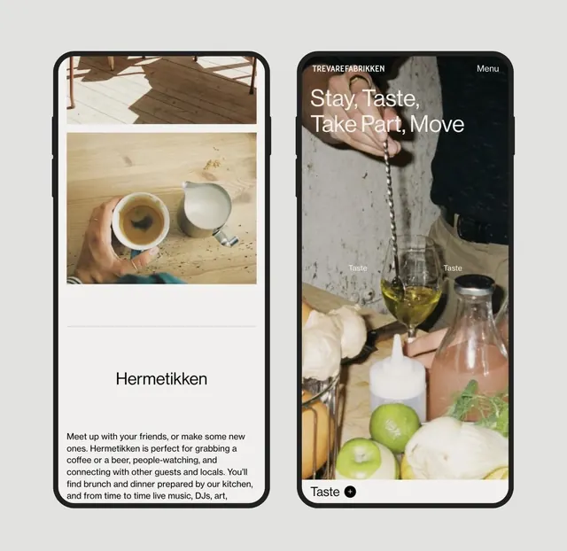
Two side-by-side phone mockups showcasing restaurant app screens for a Nordic hospitality brand, mixing lifestyle photography with tap-to-browse UI patterns.
Summary
Mobile app wireframes for a Nordic restaurant and social space, combining lifestyle food photography with text-driven navigation and label-based ingredient browsing.
Visual description
Two vertical phone frames side by side on a neutral background. Left frame shows a hand holding a coffee over rustic wood, with the brand name "Hermetikken" below in large sans-serif, followed by body copy describing the venue as a meeting spot for coffee, beer, and social activities. Right frame displays the app's interaction layer: a dark hero section with visible text "Stay, Taste, Take Part, Move" overlaid on food-and-drink photography, and below it are labeled tap-buttons ("Taste") next to images of olive oil, white plates, and fresh produce. The earthy palette uses warm beiges, creams, olive greens, and dark browns, evoking handcraft and natural ingredients.
Key takeaway
The side-by-side contrast between lifestyle photography and functional app UI; label-button pairing (text label next to tappable zone) as an alternative to icon-only navigation; warm, earthy neutral palette that feels organic without being oversaturated; body copy that humanizes the venue before showing interactive features.
Reuse notes
Ideal for food, beverage, or hospitality apps where atmosphere and craft matter as much as function. The split-screen format works well to pitch both the brand experience (left) and the interactive features (right). Avoid if the product needs intense density or data-heavy interaction patterns; this approach prioritizes mood and browsability over information architecture.
More like this
Keep what you find
A free account saves references to boards and can send you a weekly email of picks based on what you save.
To see every result, go Pro.