Preview image. Unlock full-res
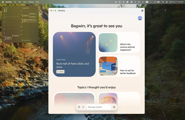
Modular card interface with rounded pill buttons, gradients, and nested content cards for personalized topic recommendations.
Summary
A personalized content discovery interface with rounded card modules, soft gradient overlays, and navigation pills for browsing curated topics.
Visual description
White modal dialog layered over a blurred nature background photo. The greeting "Bagwir, it's great to see you" anchors a two-column layout with a large card on the left (dusky blue gradient background, white text, plus a secondary card below), and two stacked smaller cards on the right. Each card uses rounded corners, drop shadows, and soft gradient fills. Pill-shaped navigation buttons sit below topic cards. Typography is clean, modern sans-serif in varying weights; smaller caption text indicates secondary information.
Key takeaway
The nested card rhythm: one dominant content card paired with supporting smaller cards creates hierarchy without visual clutter. Gradient overlays on photographic content add depth while keeping text legible. Rounded pill buttons act as tactile, familiar navigation cues within the card ecosystem.
Reuse notes
Strong pattern for personalized onboarding, recommendation engines, or content discovery flows. Works well as a modal overlay. Gradient approach pairs well with photography; ensure contrast on text for accessibility.
More like this



Keep what you find
A free account saves references to boards and can send you a weekly email of picks based on what you save.
To see every result, go Pro.