Preview image. Unlock full-res
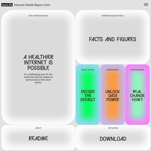
Split-panel document layout with white rounded containers on light grey and three vibrant gradient cards organizing topic summaries.
Summary
A document layout combining white rounded panels with vibrant gradient topic cards to organize complex information in a digestible, modular structure.
Visual description
Light grey background with four rounded white panels arranged in a 2x2 grid. Left column hosts a text-heavy section with black serif typography on pale grey background. Right column contains three tall rounded cards with vivid gradient fills: cyan-to-bright-green (labeled "DECODE THE DEFAULT"), lavender-to-orange (labeled "UNLOCK DATA POWER"), and hot-pink-to-soft-pink (labeled "REAL CHANGE HOW?"). Each card uses thick black sans-serif numerals or labels. Small icon diagrams sit at the top (wavy lines, ovals, ellipse). Top header reads "END OF YEAR ANALYSIS" and "INTERNET HEALTH VITALS" with Mozilla logo. Bottom panels are labelled "ABOUT" and "README" / "DOWNLOAD".
Key takeaway
The tight pairing of quiet white panels (for narrative prose) with high-saturation gradient cards (for key topics): creates instant visual contrast and guides the eye to the punchline. Bold typography inside gradients sits confident without any outline or stroke. Soft horizontal spacing between rows feels less cramped than a strict grid.
Reuse notes
Strong for reports, health/wellness sites, or multi-topic landing pages where you need to balance detailed text with eye-catching summary cards. Works best when text panels are truly muted so gradients pop. Avoid if the data inside cards needs sustained reading; this layout favors punch over depth.
More like this


Keep what you find
A free account saves references to boards and can send you a weekly email of picks based on what you save.
To see every result, go Pro.