Preview image. Unlock full-res
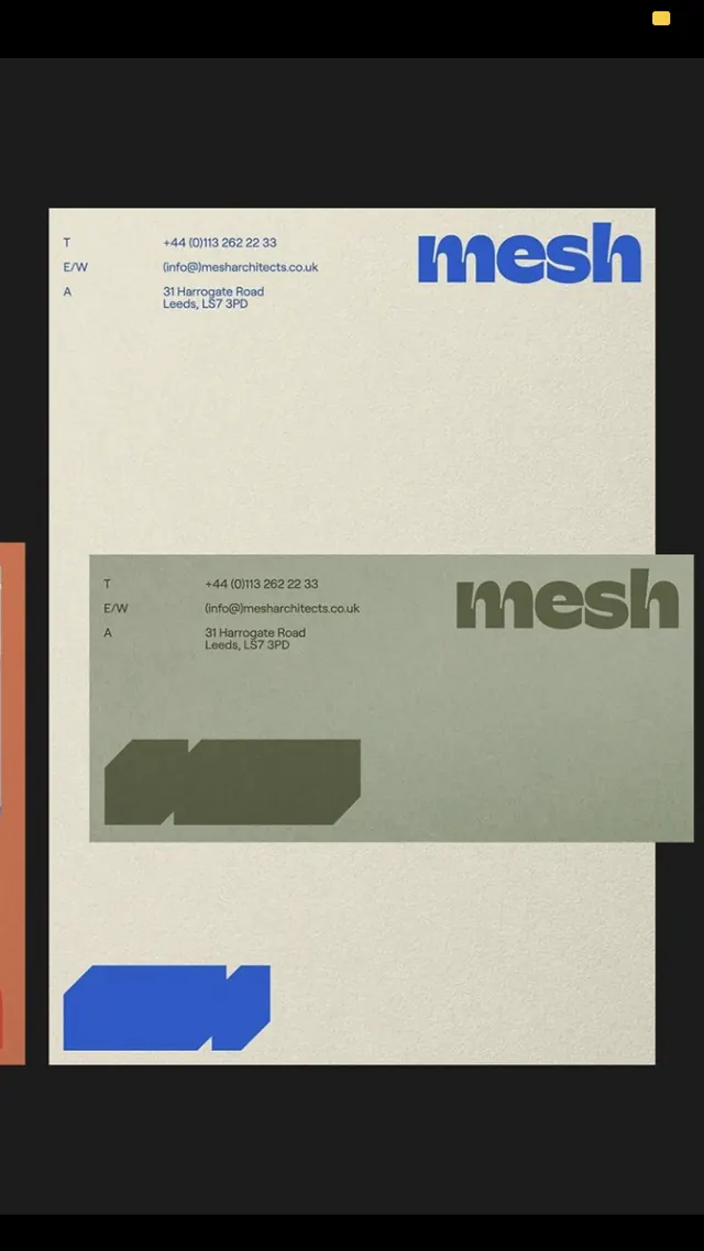
Three stacked rectangular cards in earthy tones (beige and olive green) with minimal sans-serif typography, treating contact information as modular block elements.
Summary
Three stacked business card mockups in muted earth tones, each presenting contact information and branding in a minimalist sans-serif layout with subtle color and typographic variation.
Visual description
Three rectangular cards photographed at a slight angle, stacked vertically and offset. Top card: cream background with small dark text (contact details) and a large olive-green sans-serif word (mesh) in the lower right. Middle card: similar cream background, more visible contact text, another mesh branding mark. Bottom card: olive-green background with white type reversed out. Each card maintains consistent margins and a restrained typographic hierarchy. The color palette alternates between cream and muted green, creating subtle visual separation without loudness. All text is flush left or right, maximizing negative space.
Key takeaway
The restraint in color: two muted earth tones create a sophisticated system without saturation; the modular stacking approach where each card is self-contained yet part of a series; the use of a single bold word (brand name) in a complementary hue to anchor each card while keeping body type small and functional.
Reuse notes
Strong template for corporate identity systems, law firms, architecture practices, or B2B consulting where quiet professionalism is the goal. The stacked mockup format works as a presentation device. The cream-and-olive palette is timeless for collateral. Avoid where vibrancy or immediate visual impact is required; this works best for audiences valuing restraint and craftsmanship.
More like this


Keep what you find
A free account saves references to boards and can send you a weekly email of picks based on what you save.
To see every result, go Pro.