Preview image. Unlock full-res
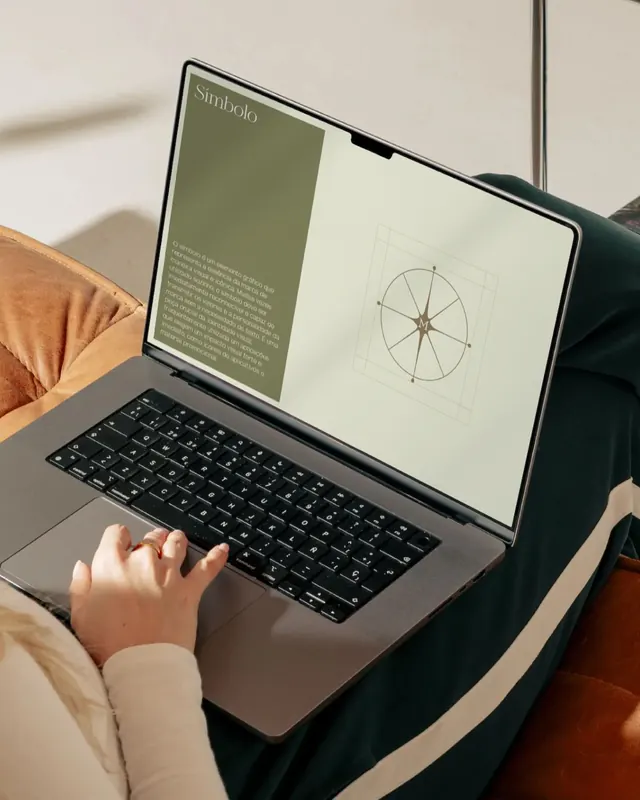
A brand identity guideline page split between sage-green textual content and cream with a centered radial geometric diagram, photographed on a laptop in context.
Summary
A brand guideline page split into two distinct zones: a sage-green text panel on the left and a cream panel on the right hosting a centered radial diagram with geometric circles and grid guides, presented as a laptop in-context product mockup.
Visual description
The laptop screen displays a split-column layout. The left panel uses muted sage green (approximately #797A5A) as a background with body copy in a lighter olive tone. The right panel is cream with a centered radial geometry diagram drawn in thin lines, consisting of concentric circles, a central star-like hub, and a light grid overlay. The photograph captures the laptop angled toward the viewer, with a warm wooden arm visible in the lower left and soft neutral interior backdrop. Typography on the visible text area is minimal and highly legible in sans-serif.
Key takeaway
The two-column split layout for separating narrative content from visual system documentation. The use of a muted, earthy color palette that feels sophisticated rather than clinical. The radial geometric diagram as a clean, scalable design system illustration that communicates order and structure without heavy detail.
Reuse notes
Effective for brand identity guidelines, design system documentation, and product overviews where clarity between narrative and visual reference is key. Works well photographed in lifestyle context to show real use. Best suited to professional, calm brands in design, tech, or marketing verticals.
More like this





Keep what you find
A free account saves references to boards and can send you a weekly email of picks based on what you save.
To see every result, go Pro.