Preview image. Unlock full-res
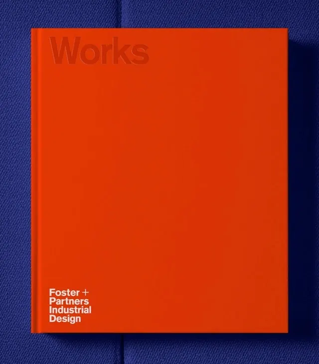
A bold cover design for a Foster+Partners industrial design works book in bright orange with minimal typography.
Summary
A minimalist book cover with a bold orange background and understated sans-serif typography identifying Foster+Partners Industrial Design.
Visual description
A square cover in bright burnt orange dominates the frame. At the top in subtly darker orange is the word "Works" in sans-serif, nearly invisible against the solid ground. At the bottom in white sans-serif type are the lines "Foster + Partners" and "Industrial Design." The back shows blue fabric texture. The color contrast is stark and high-contrast. The treatment is typographic minimalism with nearly all visual weight coming from the saturated orange field.
Key takeaway
The nearly-invisible watermark effect of "Works" and the compositional discipline of placing just one detail (the studio name) at the bottom shows sophisticated restraint. The color alone does the heavy lifting. Works for institutional or portfolio contexts where the studio's reputation precedes the book.
Reuse notes
Excellent reference for design-forward corporate identity and portfolio presentation. The techniques apply well to luxury book covers, institutional branding, and agency portfolios. The color-forward minimalism signals confidence and sophistication. Pairs well with publication design and architectural portfolios.
More like this


Keep what you find
A free account saves references to boards and can send you a weekly email of picks based on what you save.
To see every result, go Pro.