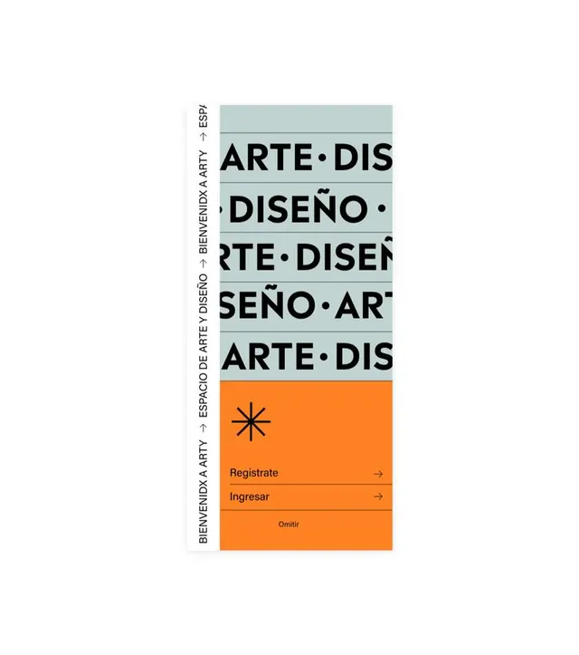
Preview image. Unlock full-res
A Spanish art/design event poster using stacked typography and a bold orange call-to-action bar.
Summary
A Spanish art/design event poster using stacked repeating typography and a bold orange call-to-action bar.
Visual description
A vertical composition on a white background featuring repeating Spanish text "ARTE DISEÑO" stacked and slightly rotated, printed in heavy black sans-serif. The text repeats four times down the left side, with a thin vertical line to the left reading "BIENVENIDA ARTE DISEÑO" (welcome art design). The lower third breaks to a bright orange rectangle containing a centered asterisk symbol, two action-oriented links ("Registrate" and "Ingresar" in black text with right arrows), and the word "Omitir" (skip) at the bottom. The top third has a pale mint-green band overlaying the repeated text, creating a color accent. The typography is bold, uppercase, geometric sans-serif with even letter-spacing and strong presence.
Key takeaway
The economy of the design: repeating a single phrase creates visual rhythm and emphasis without introducing new content. The orange bar with directional affordances (arrows) is unmissable. Layering a translucent color bar over repeating type adds depth without clutter. The centered asterisk symbol serves as a visual separator with personality.
Reuse notes
Effective for event posters, art exhibition signage, or bilingual registration flows. The vertical stacking works well when space is narrow (portrait orientation, mobile, narrow column). Scale the type boldly; this design lives at large sizes. The orange-on-white contrast is high; adapt the accent color only if your event has a distinct brand identity.
More like this
Keep what you find
A free account saves references to boards and can send you a weekly email of picks based on what you save.
To see every result, go Pro.