Preview image. Unlock full-res
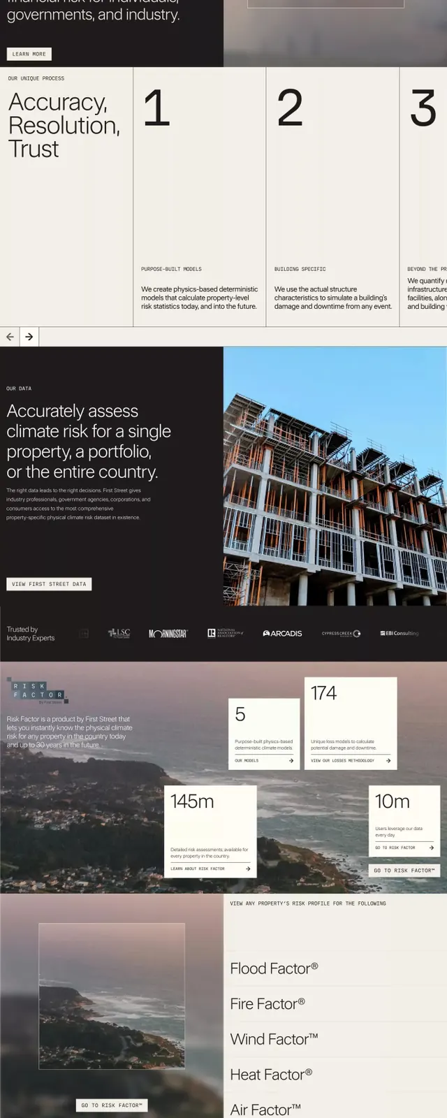
Multi-section climate risk assessment document with large photography, numbered framework blocks, and restrained earthy typography on a warm neutral background.
Summary
Long-form climate risk assessment document structured in stacked sections, each containing a headline, photography, and text blocks, unified by a warm-neutral color story and sans-serif typography.
Visual description
The layout scrolls vertically through distinct content zones: an atmospheric nature photograph with an overlaid headline in large sans-serif at the top; a dark gray block with white type and a "Learn more" link; a pair of landscape images separated by a text block; a numbered three-column framework (1, 2, 3) each with a heading and supporting copy; a large building photograph spanning full width with dark background callout text; a data-visualization section showing risk factors (145m, 10m, 174) in an asymmetric grid layout; and a bottom section promoting a toolkit with product terminology ("Flood Factor", "Fire Factor", "Wind Factor", "Heat Factor", "Air Factor"). The entire palette stays within off-whites, warm grays, and near-blacks, creating visual restraint. Typography remains consistent and unhurried throughout.
Key takeaway
The sectioned-yet-unified approach handles complex information by grouping it into digestible blocks without visual chaos, using photography to anchor each section emotionally. The warm-neutral color palette makes technical and environmental content feel serious but not cold. The numbered framework concretizes abstract concepts and signals a strategic approach. Generous spacing and restricted type scale keep the scan path clear.
Reuse notes
Strong template for B2B case studies, climate/sustainability communications, fintech explanations, and risk-assessment documents. Works well when blending landscape photography with data and policy messaging. The warm earthy tones suit environmental and financial sectors especially well. Keep paragraphs short and photography prominent to avoid density.
More like this


Keep what you find
A free account saves references to boards and can send you a weekly email of picks based on what you save.
To see every result, go Pro.