Preview image. Unlock full-res
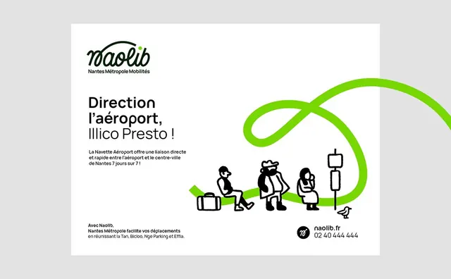
Public transit campaign for Nantes airport connecting to city center via a bright lime-green flowing line that threads through illustrated travel icons.
Summary
Public transit campaign using a lime-green connective line to guide travelers from airport to city center, threading through stylized silhouettes and icons.
Visual description
Landscape poster on a white background. Naolib wordmark and tagline top-left. French headline ("Direction l'aeroport, Illico Presto!") in bold sans-serif on the left third. The dominant visual is a bright lime-green looping line that flows horizontally across the composition, connecting a sequence of simple black icons (suitcase, three-person family group, woman, transit sign post). Below the line, contact details and secondary messaging in smaller sans-serif type. The overall logic is narrative and directional, using the flowing line as both movement cue and design continuity.
Key takeaway
The flowing connective line as a graphic device that both organizes content and metaphorically conveys journey and flow without needing arrows or explicit direction markers. The pairing of minimal iconography with clean typography and high-contrast black and lime creates visual clarity and stops. The structural use of left-aligned text (information architecture) paired with right-anchored visual narrative.
Reuse notes
Strong fit for transportation, mobility, and public service campaigns. The lime accent reads as energetic and forward-looking; works well for transit, logistics, or any flow-based narrative. Adapts to digital (as buttons, banners) due to the simplified icon approach.
More like this




Keep what you find
A free account saves references to boards and can send you a weekly email of picks based on what you save.
To see every result, go Pro.