Preview image. Unlock full-res
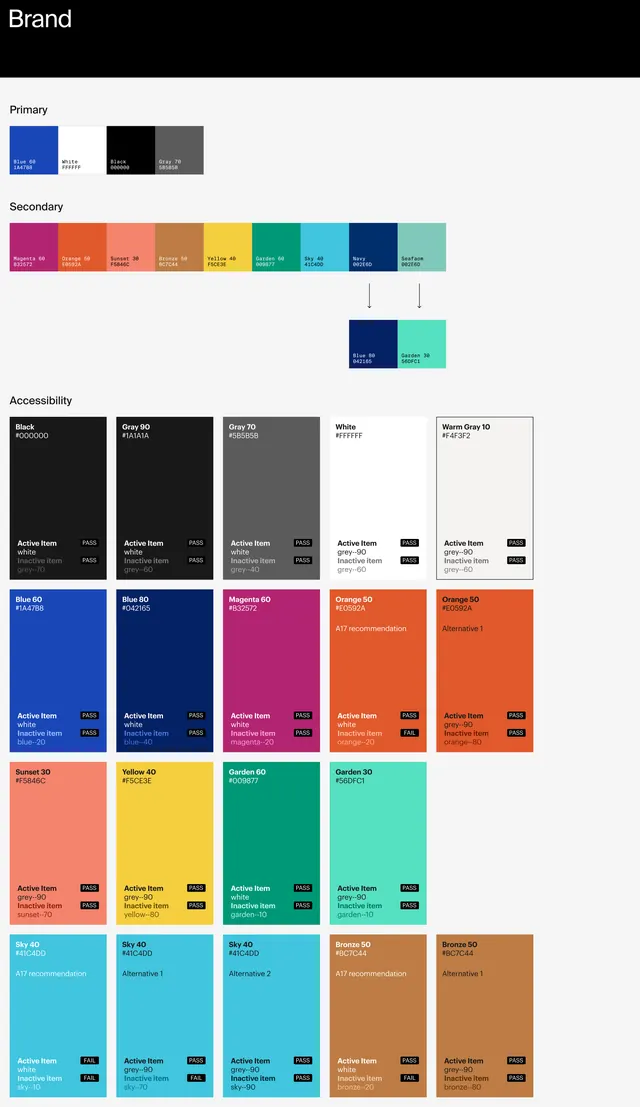
A comprehensive design system specification document showing Getty's brand primary and secondary color palettes, accessibility considerations, and usage guidelines.
Summary
A comprehensive design specification document for Getty's 2020 brand guidelines, detailing a primary color scheme and expanded secondary palette with accessibility guidance.
Visual description
A vertical specification sheet organized into labeled sections showing: "Brand" heading at top; "Primary" section with small color swatches of deep blue, black, and gray; "Secondary" section displaying a wide array of vibrant colors including magenta, coral, gold, yellow, green, and teal arranged in a horizontal row; "Accessibility" section showing large color blocks with paired typography samples demonstrating contrast ratios; and multiple rows of application examples showing color cards with "ACTIVE State" and color values. Each color is paired with detailed text information including hex codes, RGB values, and usage notes. The overall design is grid-based and systematic, emphasizing clarity and specification.
Key takeaway
The document demonstrates how to structure a brand color system with both aesthetic and technical considerations. The organization progresses from core colors to expansive palette to accessibility validation, showing that comprehensive brand guidelines require both creative choice and technical rigor. The accessibility section prominently displays contrast ratios and type pairing, showing modern design system thinking.
Reuse notes
Excellent reference for creating comprehensive brand guidelines and design systems, particularly for corporate or technical clients. The structure (primary, secondary, accessibility) is a best-practice template. The color palette itself is sophisticated and modern, balancing warm and cool tones. The accessibility-first approach is increasingly expected in professional brand work. Works well for understanding how to present color specifications to development teams. The monospace typography for hex values is a small detail that improves technical clarity.
More like this





Keep what you find
A free account saves references to boards and can send you a weekly email of picks based on what you save.
To see every result, go Pro.