Preview image. Unlock full-res
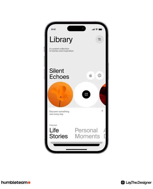
Mobile app screen displaying a curated content library with bold circular image thumbnails, minimal typography, and card-based section layout.
Summary
Mobile app screen for a content library showing stacked sections with large circular image thumbnails, a page title, descriptive tagline, and category cards at the bottom, all set in clean sans-serif on a light background.
Visual description
A single iPhone mockup (full device chrome visible) displaying a white background with "Library" as a large sans-serif headline and "A curated collection of stories and inspiration" as supporting text. Below, a featured section titled "Silent Echoes" with "Discover something new every day" spans most of the viewport width, featuring a prominent orange circle (representing media content) flanked by smaller circular profile icons. Below that, category cards labeled "Life Stories" and "Personal Moments" appear in gray and beige tones. Small icon buttons sit in the top-right corner. The overall spacing is generous and the layout feels spacious and breathing.
Key takeaway
Large circular imagery as primary visual content in a mobile collection interface. Generous whitespace around elements to create a premium, unhurried feel. Combining bold content blocks (circle imagery) with quiet typography and muted grays for visual hierarchy without decoration.
Reuse notes
Strong reference for content-discovery or media-curation apps (podcasts, playlists, article collections, gallery apps). The card-based stacking pattern suits vertical scrolling on mobile. Light, minimal approach works well when the imagery or content itself is the visual star, not the design system.
More like this
Keep what you find
A free account saves references to boards and can send you a weekly email of picks based on what you save.
To see every result, go Pro.