Preview image. Unlock full-res
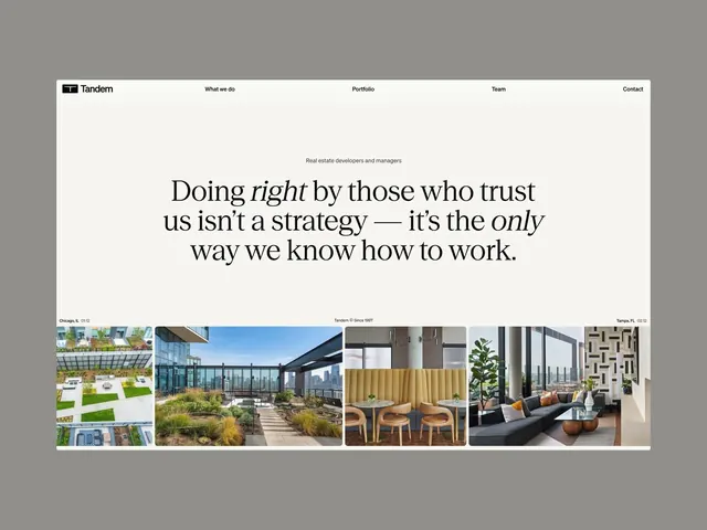
Corporate real-estate website hero featuring a centered serif-and-italic headline statement about trust, anchored by a horizontal portfolio gallery of architectural and landscape imagery.
Summary
A corporate hero page for a real-estate firm centered on a trust-focused serif headline, with navigation and a portfolio image gallery showcasing completed architectural and landscape projects.
Visual description
The layout is split into two zones. The upper zone contains a horizontal navigation bar: a simplified "Tandem" logo at far left, then menu items (What we do, Portfolio, Team, Contact) aligned right. Below, a large centered serif headline dominates the middle third, reading "Doing right by those who trust us isn't a strategy, it's the only way we know how to work." The word "right" uses italic serif for emphasis. A small sans-serif callout above the headline identifies the audience: "Real estate developers and managers". The background is off-white/cream. The lower third showcases a horizontal scrolling or grid gallery of five project images: landscaped courtyards, architectural exteriors, interior seating, and modern office/residential spaces. Each photograph displays completed work in warm, natural light. The entire composition uses neutral tones (whites, warm grays, natural materials) allowing the photography to carry the visual interest.
Key takeaway
The trust statement as the central hero text (rather than a product promise) immediately establishes values alignment. Mixing serif and italic within the same sentence creates subtle emphasis without caps or bold. A simple portfolio gallery directly below the hero statement proves the claim through work samples, creating a persuasive proof-of-competence immediately visible on page load. The minimal navigation and neutral palette keep attention on the headline and imagery.
Reuse notes
Effective for professional services, architecture firms, real-estate developers, and agencies. The approach works well for B2B brands emphasizing trustworthiness and a track record. The serif/italic contrast pairs well with a portfolio or case-study section. Ensure the hero images are high-quality and relevant; weak photography will undermine the trust message. Works on both desktop and mobile if the gallery is responsive.
More like this




Keep what you find
A free account saves references to boards and can send you a weekly email of picks based on what you save.
To see every result, go Pro.