Preview image. Unlock full-res
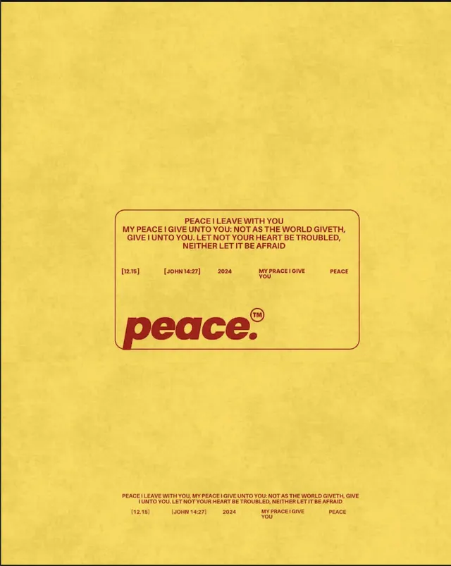
Meditative print design with centered 'peace' wordmark on warm mustard background, framed by scripture references and formal typography.
Summary
A contemplative religious print with bold centered "peace" wordmark on warm mustard, surrounded by scripture references and formal typography in a symmetrical layout.
Visual description
A full-bleed mustard-yellow ground holds a centered composition. Small burgundy text sits at the top in a tight, formal layout listing scripture references and attributions. The large "peace" wordmark appears in lowercase burgundy sans-serif, positioned centrally in generous whitespace. Below, another block of smaller burgundy text, equally formal and centered. The entire layout is symmetrical and reverent, with deep red-brown type creating a solemn, intentional rhythm. No imagery, no color variation. The vintage halftone texture gives the mustard a subtle grain.
Key takeaway
Centered single-word branding gains power through generous isolation. Formal, all-caps scripture typography creates credibility and reverence without decoration. Warm mustard is unexpected for religious material but reads meditative and approachable rather than corporate.
Reuse notes
Strong for spiritual organizations, meditation apps, or liturgical publishers. The warm, simple color reduces preachiness and feels more community-oriented. Works at any scale due to type-only composition. Pair with generous margin and offline context (print, social graphics) for best effect.
More like this

Keep what you find
A free account saves references to boards and can send you a weekly email of picks based on what you save.
To see every result, go Pro.