Preview image. Unlock full-res
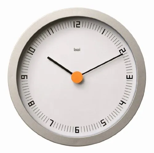
Brutalist concrete-faced wall clock with sans-serif numerals, black hands, and orange center accent dot.
Summary
A concrete-faced minimalist clock with sans-serif numerals, thin black hands, and a single bright-orange center dot.
Visual description
Circular wall clock with a cast-concrete or stone-textured face in warm gray-beige. Large bold sans-serif numerals (1-12) in dark charcoal positioned at cardinal and intercardinal points; minute markings are thin radial lines. Two slender black hands (hour and minute) extend from center. The center is a single bright orange spherical accent dot where the hands pivot. Face design is restrained: minimal visual noise, maximum legibility. Appears to be a product shot with neutral white background. Brand marking "bai" visible in small serif at center-top of dial.
Key takeaway
The single accent color (orange) on an otherwise monochromatic surface does all the visual work and draws the eye without distraction. Concrete texture paired with bold numerals reads as premium/designer despite simplicity. The thin hands and restrained dial create a "Braun" / Swiss-influenced industrial aesthetic that pairs well with contemporary interiors. Numerals on the cardinal points alone (no every-numeral ring) is an understated choice that works.
Reuse notes
Excellent reference for product design, industrial aesthetics, and minimalist interfaces. The monochrome-plus-one-accent formula works across home goods, apps, dashboards, and controls. Concrete texture and bold sans-serif numerals anchor this firmly in the 2010s-2020s designer-product category. Not suitable for playful or warm contexts; reserve for corporate, technical, or luxury brands.
More like this






Keep what you find
A free account saves references to boards and can send you a weekly email of picks based on what you save.
To see every result, go Pro.