Preview image. Unlock full-res
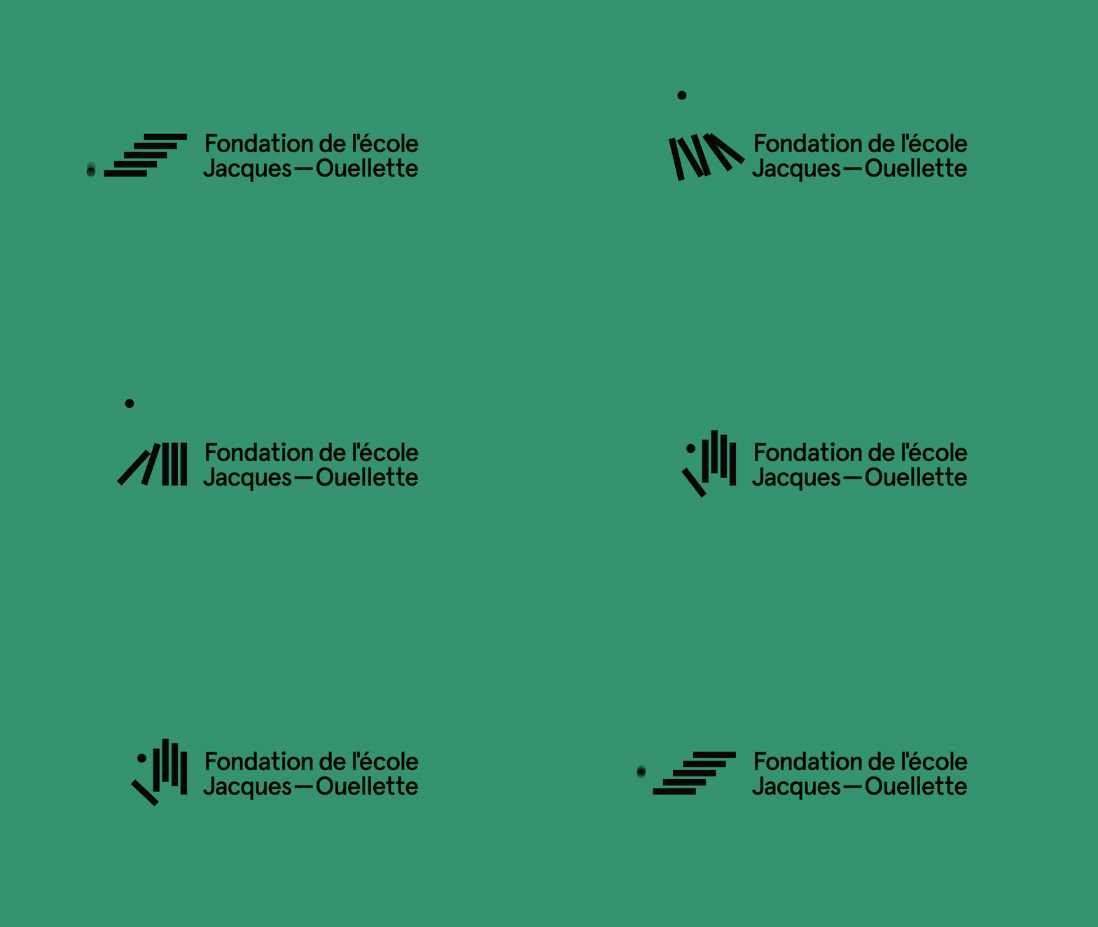
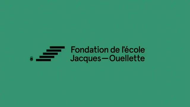
A French educational foundation identity combining a geometric dash-mark icon with bold display-serif wordmark on a cool teal background.
Summary
An educational institution's identity system showing a simple geometric mark paired with a large-scale display typeface on a deep teal ground.
Visual description
A solid cool-teal background, nearly filling the frame, anchors the composition. On the left sits a geometric mark made of five stacked horizontal dashes, decreasing in width from bottom to top, followed by a small circular dot. The mark is rendered in pure black. To the right, oversized sans-serif typography reads "Fondation de l'école Jacques-Ouellette" in black, positioned at center height, with the wordmark spanning approximately three lines due to the long institutional name. The overall effect is centered but asymmetric, with negative space balanced between the icon and text. The teal background is uniform, and the contrast between black marks and the muted-green ground is high and legible.
Key takeaway
The mark design, a variation on a bullet-and-dash visual language, is simple enough to work at any scale while remaining distinctive. The combination of a geometric mark (stacked lines) with bold display type creates instant recognition without ornament. The monochromatic color choice (black on teal) signals seriousness and stability typical of education and nonprofit sectors.
Reuse notes
A model for institutional identities in education, nonprofits, and civic organizations. The mark-and-wordmark system is horizontal and works well on letterheads, signage, and digital headers. The deep teal is regional or cultural in character, reading more European than North American. Best paired with generous white space and light sans-serif body copy.
More like this




Keep what you find
A free account saves references to boards and can send you a weekly email of picks based on what you save.
To see every result, go Pro.