Preview image. Unlock full-res
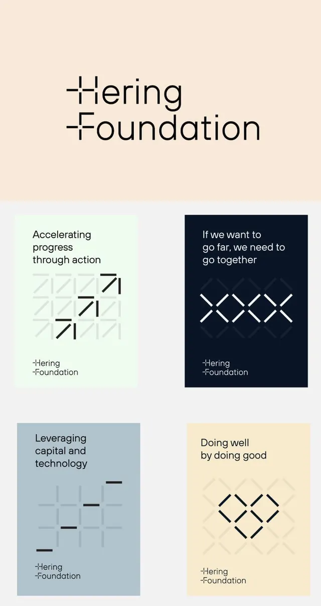
Modular institutional identity with five paired cards showcasing a foundation's mission statements and symbolic geometric icons on a cream-to-navy-to-pale-blue color palette.
Summary
A five-card institutional identity system for a foundation, each card pairing a mission statement with a different background color (cream, light, navy, blue-grey, pale yellow) and a sparse geometric icon (grid, crosses, diamonds).
Visual description
Vertical stack of five cards, each a discrete statement + icon pairing. Top section shows the foundation name in oversized sans-serif. First card (cream background): "Accelerating progress through action" with a light grid pattern and darker diagonal lines. Second card (light gray): "If we want to go far, we need to go together" on navy background with white crosses arranged in loose rows. Third card (light blue-grey): "Leveraging capital and technology" with faint grid and a few strong black horizontal marks. Bottom card (pale yellow): "Doing well by doing good" with a symmetrical diamond pattern. All text is centered, mid-weight sans-serif, black or white for contrast. Icon style is minimalist, using only straight lines and geometric shapes. The palette uses soft, muted earth tones and cool grays that feel refined without being cold.
Key takeaway
The modular card system applies a single foundation identity across multiple messages without repetition. Each card's background color zones a distinct concept while the constrained icon grammar (only lines and geometric forms) maintains visual unity. The pairing of text above and icon below creates clear hierarchy and makes each statement memorable.
Reuse notes
Ideal for institutional or nonprofit identity systems where multiple guiding principles or values need equal weight. The color-zoning technique allows each principle its own visual territory. Works well printed or digital. The geometric icon system is restrictive by design; commit to a tight symbol set to maintain credibility. Scale the text to ensure readability in both large (poster) and small (business-card) contexts.
More like this


Keep what you find
A free account saves references to boards and can send you a weekly email of picks based on what you save.
To see every result, go Pro.