Preview image. Unlock full-res
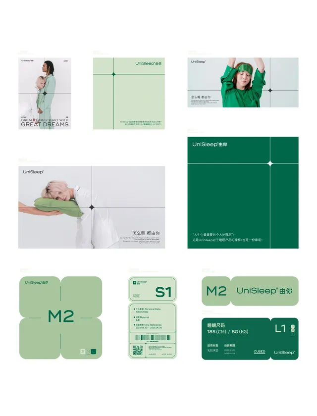
Sleep wellness brand identity system with mint-green and dark-green palette across photography, packaging, cards, and modular product information displays.
Summary
Multi-piece collateral system for UniSleep, a wellness brand, unifying lifestyle photography with modular product cards, QR-enabled tags, and packaging in a mint-and-dark-green palette.
Visual description
A grid of brand system components arranged in an organized composition. Top row: a lifestyle photograph of a woman in mint-green clothing (left), a folded packaging insert with mint background and small "UniSleep" text (center), and a portrait of another person in green (right). Second row: a lifestyle shot of sleeping infant (left) paired with layout guides on light grey. Third row: modular card system with mint-green rounded squares labeled "M2" and "UniSleep" alongside a small credentials card (S1) and a tagged product label (L1) with QR code and product specifications. All typography is sans-serif in dark text, with generous white space and a consistent teal-to-mint-to-neutral color field. Cards follow a grid-based modular system with clear hierarchy.
Key takeaway
The modular card system is reusable and scalable across formats. Mint green is deployed as both primary color and accent, keeping the palette cohesive. Pairing lifestyle photography with clean geometric product components balances human warmth with technical clarity. QR codes and labels are integrated naturally into the grid without feeling forced.
Reuse notes
Strong reference for healthcare or wellness brand systems needing calm, approachable identity. The mint-on-white balance works well for consumer apps and subscription services. Lifestyle photography must be genuine (not stock) to land the trust; if unavailable, lean harder on the geometric card system and white space.
More like this


Keep what you find
A free account saves references to boards and can send you a weekly email of picks based on what you save.
To see every result, go Pro.