Preview image. Unlock full-res
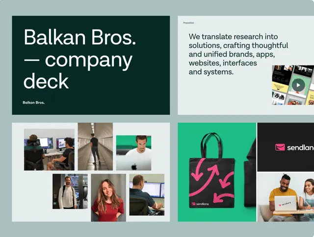
Company deck for Balkan Bros with split-screen headline, grid of lifestyle photography, mixed media blocks, and teal-and-black color scheme.
Summary
A company deck mockup for Balkan Bros featuring a split-screen design: left side shows the company name and tagline, right side displays a grid of lifestyle photography, media assets, and a teal accent block with brand messaging.
Visual description
Soft teal background on the left third contains bold black sans-serif headline "Balkan Bros." with a thin horizontal rule, below it smaller text "Balkan Bros". On the white right side, a three-by-three grid of lifestyle and product photography (people in work settings, clothing, office candids) sits above a text block reading "We translate research into solutions, crafting thoughtful and unified brands, apps, websites, interfaces and systems." A teal rectangular accent block occupies the far right with geometric shapes and a small product or logo detail. Black typography and white space create high contrast; the teal acts as a secondary accent.
Key takeaway
The split-background approach (color on left, white on right) anchors the headline without boxing it. Mixing a large text block with a dense photography grid and a separate accent block in one frame shows hierarchy through positioning rather than size alone. The teal accent in the bottom-right creates visual closure.
Reuse notes
Effective for agency or B2B company decks that need to balance statement copy with visual proof (photos, work samples). The soft teal-plus-black palette reads contemporary and trustworthy. Works especially well when lifestyle photography has consistent color temperature. The grid density works as a visual "proof of work" without naming clients.
More like this


Keep what you find
A free account saves references to boards and can send you a weekly email of picks based on what you save.
To see every result, go Pro.