Preview image. Unlock full-res
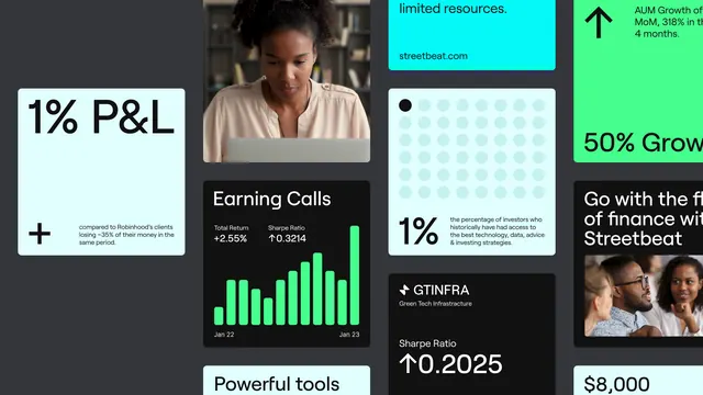
A dark fintech dashboard grid mixing typography, photography, and bright data charts to show performance metrics and growth stories side-by-side.
Summary
A dark fintech dashboard grid mixing typography, photography, and bright data charts to show performance metrics and growth stories side-by-side.
Visual description
The composition is organized as an asymmetric grid with tight white spacers dividing each section. A dark charcoal background anchors the palette. Top-left shows a bold "1% P&L" label with a small explanatory icon-text pair below. Center-left frames a portrait photo of a woman under the heading "Earning Calls" with two KPI badges ("+2.85%", "78 calls") and a tall bright-green bar chart showing Jan-22 to Jan-23 data. Turquoise and neon-green text labels float in the top right ("limited resources", "50% Growth", "AAM Growth") on contrasting color blocks. Bottom sections show "Powerful tools", a small teal dot, a light blue dot-grid pattern labeled "1%", and a right-side section with "StreetBeat" and "$8,000" copy alongside a second portrait. Typography throughout is clean sans-serif in white, teal, and bright green.
Key takeaway
The strategic use of one or two accent colors (neon green and bright cyan) against a dark background to make data stand out without feeling garish. The mixing of charts, photography, and text at different scales to create information hierarchy. The tight grid spacing that keeps dense content from feeling cluttered.
Reuse notes
Strong template for financial/investment dashboards, performance-metric displays, and any fintech interface needing to communicate multiple competing data stories. Works best when you have both human faces and hard metrics to showcase. The dark background requires high-contrast text and glowing highlights.
More like this

Keep what you find
A free account saves references to boards and can send you a weekly email of picks based on what you save.
To see every result, go Pro.