Preview image. Unlock full-res
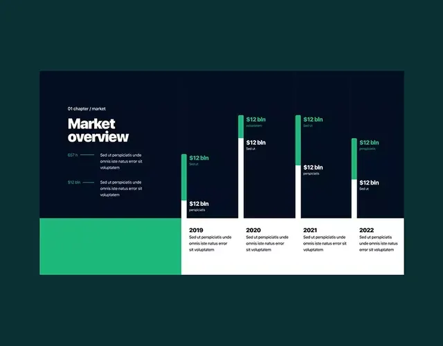
Year-by-year financial data dashboard using teal-green accent bars and navy column charts against a teal background to display market metrics and dollar figures.
Summary
Year-by-year financial data dashboard using teal-green accent bars and navy column charts against a teal background to display market metrics and dollar figures.
Visual description
Teal background with a dark navy inset container in the upper portion. White "Market overview" headline and a legend showing "$67k" and "$32.5bn" with descriptive labels in light gray. To the right, grouped green accent bars and navy columns display "$12 bln" values in white type. The lower portion transitions to a white grid showing four columns labeled 2019, 2020, 2021, 2022, each with navy column indicators and italicized descriptive text repeated across the timeline. A large bright teal rectangle anchors the left lower quadrant as a neutral color mass.
Key takeaway
The color pairing of a warm teal background with cool navy data columns creates visual separation and focus. The combination of bar accents and full columns allows comparing both aggregate and year-by-year figures without separate charts. The legend-and-chart layout is compact; using a large neutral color block as a stabilizing visual element prevents the dashboard from feeling too data-dense.
Reuse notes
Works well for financial overviews, market reports, and investor decks needing to show multi-year trends. The teal-and-navy combination reads as professional and data-forward without being clinical. Scale the legend for different metrics; the modular column treatment allows adding or removing years easily. Best when the actual data labels are specific (not placeholder text).
More like this






Keep what you find
A free account saves references to boards and can send you a weekly email of picks based on what you save.
To see every result, go Pro.