Preview image. Unlock full-res
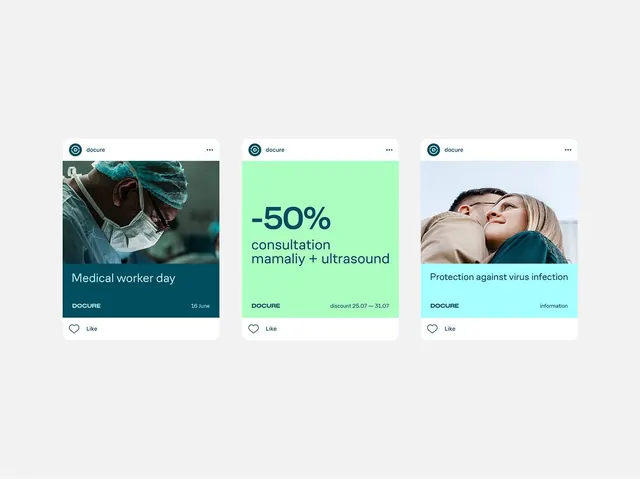
Three vertically stacked card mockups showcasing healthcare promotions in distinct color zones: teal photo card, bright mint discount card, and pale blue information card.
Summary
Three horizontally aligned card mockups demonstrating color-coded healthcare content zones: a dark teal card with medical-worker imagery, a bright mint card with a -50% discount offer and appointment text, and a pale blue card with virus-protection messaging.
Visual description
Horizontal three-column layout on a neutral light-gray background. Each card is a vertical rectangle with rounded header, a distinct colored content area (teal with photographic image, mint with sans-serif typography, light blue with portrait photo), and a white footer zone with the Docure branding and a heart-icon Like action. The cards use solid color backgrounds to isolate and prioritize each promotional unit. Typography is clean, left-aligned sans-serif in dark tones with high contrast against the colored zones.
Key takeaway
Color-coding as an information hierarchy tool in card-based layouts: distinct hues (cool teal, bright mint, pale blue) allow rapid scanning while the consistent card structure maintains coherence. Combining photographic and typographic cards in one grid adds visual variety without chaos.
Reuse notes
Well-suited for healthcare platforms, appointment systems, insurance portals, and medical-service applications needing to surface multiple offers or service tiers. The cool palette reads as clinical without feeling cold. Works equally at mobile and desktop widths when cards are stacked or wrapped.
More like this






Keep what you find
A free account saves references to boards and can send you a weekly email of picks based on what you save.
To see every result, go Pro.