Preview image. Unlock full-res
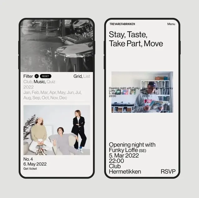
Paired phone mockups for an event ticketing app in minimalist black and white, emphasizing typography and event card hierarchy.
Summary
Paired phone mockups for an event ticketing app using a black and white palette, with distinct layouts balancing event imagery and card-based information.
Visual description
Two vertical phone frames side by side. Left frame shows a black and white event listing with a prominent photograph of people, sparse text, and minimal borders. Right frame displays "Stay Taste, Take Part, Move" as a heading with a mosaic of event-related photographs below, followed by event details (date, duration, location, RSVP). Both frames use sans-serif type, consistent gutters, and rely on contrast between dark text, white space, and image content. The overall aesthetic is editorial and publication-like, treating each event card as a discrete visual unit.
Key takeaway
The split-screen mockup approach showing two distinct content hierarchies. The tight vertical rhythm in the left frame (stacked photos and minimal type). The mosaic photo treatment in the right frame with bold typography anchoring the event details below.
Reuse notes
Strong reference for event-discovery or ticketing apps. Works for music, cultural events, or venue promotions. The high-contrast monochrome keeps focus on type and image without color distraction. Readable at small mobile sizes.
More like this



Keep what you find
A free account saves references to boards and can send you a weekly email of picks based on what you save.
To see every result, go Pro.