Preview image. Unlock full-res
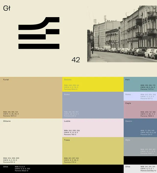
A typographic and palette specimen for a Polish civic design system showing a stacked geometric typeface paired with a saturated color grid of earth tones, yellows, and grays.
Summary
A Polish civic design system specimen pairing a stacked display typeface with a saturated color palette of earth tones, bright yellow, and gray, organized in a modular grid with Pantone references.
Visual description
Upper portion: light cream background with the mark "Gt 42" rendered as three stacked horizontal bars (top one curved) in black, suggesting movement or direction. A grayscale urban street photograph sits top-right. Lower portion: a rigid color grid displaying twelve distinct color blocks arranged in four rows and three columns. Each swatch is labeled with a Polish name (Fyrtel, Swiatlo, Park, Rzeka, Niebo, Cegla, Glowna, Ludzie, Deszcz, Trawa, Mgla, Ulica) and accompanied by RGB, CMYK, and Pantone values. The palette includes warm beige-sand tones, a bright saturated yellow, cool blue-gray, dusty rose, and pure black, all rendered in condensed sans-serif type at small scale for legibility.
Key takeaway
The stacked bar mark reduces complexity to pure geometry while suggesting motion and infrastructure. Pairing named colors (rather than generic labels) makes a palette memorable and emotionally resonant. The modular grid presentation with technical color specs serves both designers (for precision) and stakeholders (for emotional reference). The warm-cool oscillation across the palette avoids monotony while keeping the overall mood calm and civic.
Reuse notes
Perfect for public services, transit systems, municipal branding, or any infrastructure-facing identity. The minimal palette and ordered grid convey trustworthiness and system thinking. Works best on physical applications (signage, vehicles, uniforms) where the earth-tone warmth and technical precision are assets. Less suited for consumer or luxury brands; the austere functional language reads civic-institutional.
More like this



Keep what you find
A free account saves references to boards and can send you a weekly email of picks based on what you save.
To see every result, go Pro.