Preview image. Unlock full-res
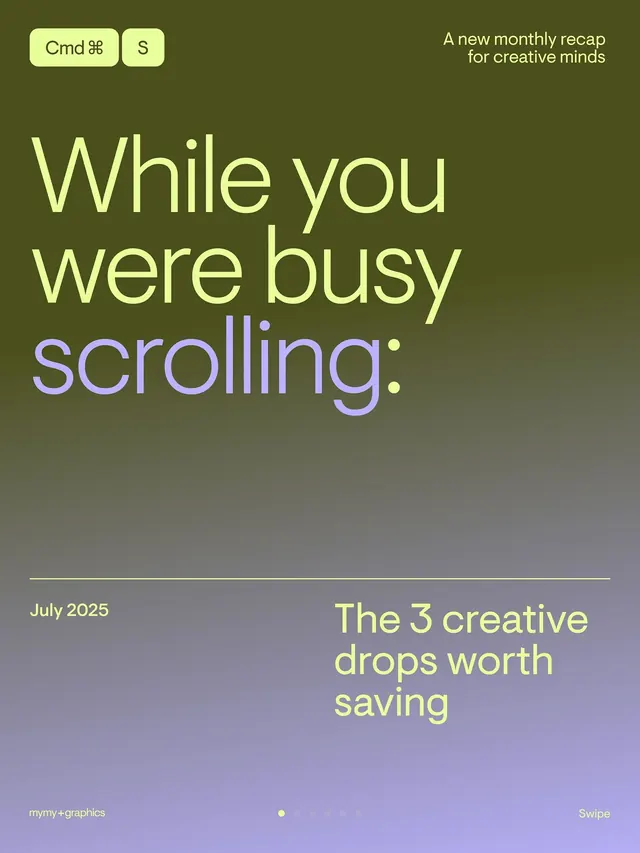
A newsletter cover with lime-green keyboard shortcuts, large serif-leaning display type in pale yellow split across two lines, and a warm olive-to-purple gradient background.
Summary
A monthly newsletter cover with oversized pale-yellow headline type, small lime-green keyboard shortcuts at the top, and a warm olive-to-purple gradient filling the background.
Visual description
The composition occupies a vertical cover card. Top left holds two rounded pill badges: "Cmd" with a command key symbol and "S", both on a pale lime background. Top right corner reads "A new monthly recap for creative minds" in smaller sans-serif. The center is dominated by three lines of pale-yellow display type: "While you were busy scrolling" followed by "scrolling" in soft purple, with a full stop in the same purple. Below, a white horizontal divider separates the upper content from the lower third. Bottom left shows "July 2025" in pale yellow, bottom right: "The 3 creative drops worth saving" in pale yellow. A subtle dot accent sits center-bottom. The entire background shifts smoothly from olive-green (top-left) through muted teal-grey (center) to soft purple-violet (bottom). The gradient suggests depth and movement.
Key takeaway
The keyboard shortcut treatment as a minimal interaction hint. The split-color display type (yellow + purple on gradient) creates readable contrast while staying playful. The two-color gradient as editorial backdrop, keeping the palette warm and limited.
Reuse notes
Ideal for creative newsletters, design digest covers, or curated content calls-to-action. The pale yellow on gradient reads well; the purple accent at the bottom confirms hierarchy. Works best when the CTA text is substantial (3-4 words minimum). Pair with serif or display type to capture editorial tone.
More like this
Keep what you find
A free account saves references to boards and can send you a weekly email of picks based on what you save.
To see every result, go Pro.