Preview image. Unlock full-res
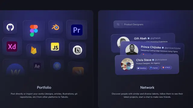
Two-panel dark interface grid: colorful app/design-tool icons on the left, user profile cards on the right, both against deep indigo background.
Summary
A side-by-side dashboard layout pairing a colorful icon grid (design tools and apps) with a user-network panel, both set against a dark indigo background.
Visual description
Left panel shows a dense grid of flat app and design-tool icons (Adobe Premiere, XD, Illustrator, After Effects, Figma, and others) in bright orange, pink, yellow, blue, and green against the deep indigo. Right panel displays user profile cards with avatars, names, and descriptive text in a cleaner stacked layout. Both sections sit against the same dark background, creating a unified interface. Clean sans-serif labels keep the composition legible and organized.
Key takeaway
The color contrast of saturated app icons against a near-black background gives even small icons punch. The two-column separation (tools left, people right) creates clear information hierarchy without needing strong dividers. Flat icon style remains readable and professional at any scale.
Reuse notes
Strong for portfolio platforms, design-tool showcases, or team dashboards. Works especially well when you need to highlight a toolkit or integrated ecosystem. The dark background makes bright accent colors sing; scaling works from mobile to desktop.
More like this

Keep what you find
A free account saves references to boards and can send you a weekly email of picks based on what you save.
To see every result, go Pro.