Preview image. Unlock full-res
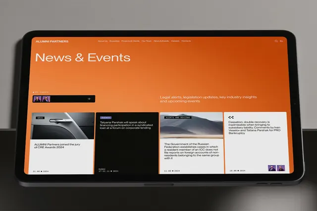
Tablet mockup for a News & Events page using a bold burnt-orange header bar and card-based layout to organize corporate news snippets, event announcements, and featured content.
Summary
Tablet interface for Alumni Partners featuring a burnt-orange top bar, card-based news grid, and subtle profile avatars to present corporate events and announcements with clear hierarchy.
Visual description
The tablet screen displays a rounded-corner landscape orientation with a solid burnt-orange (#C64F10) header bar containing navigation links (About Us, Expertise, Projects & Clients, Our Team, News & Events, Careers, Contacta) in white sans-serif. The main headline "News & Events" sits in white below. The content area on white shows a grid of four overlapping card tiles: the left card features a dark image with "NEWS" label and event date; two center cards on orange and white backgrounds contain event descriptions and supporting imagery (one shows Tatyana Parshak speaking, another the Russian Federation); a right card adds white space and sidebar information. Small purple circular profile avatars appear in corners as visual accent. The layout balances dense information with breathing room through card separation and background color variation.
Key takeaway
Burnt-orange or warm accent colors create visual hierarchy without overwhelming neutral layouts. Card-based grids organize news/events efficiently while small avatar icons add human scale. A bold colored header bar can unify a product while the content area stays neutral and readable.
Reuse notes
Effective for corporate news portals, alumni management platforms, and professional services sites. The warm accent works well for organizations wanting to feel approachable despite formal tone. Avoid on mobile due to landscape orientation; consider responsive redesign if adapting.
More like this

Keep what you find
A free account saves references to boards and can send you a weekly email of picks based on what you save.
To see every result, go Pro.