Preview image. Unlock full-res
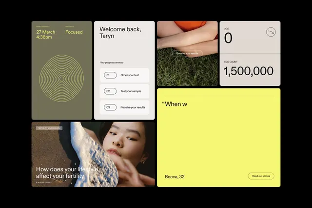
A health-tracking app interface grid featuring mixed-size modular cards combining date/time display, data visualization, natural photography, and bright neon-yellow accent panels.
Summary
A responsive grid interface for a personal health app with variable-sized card modules, combining date/time information, circular data visualization, natural textures, greeting text, numerical KPI displays, and a neon-yellow accent panel.
Visual description
Dark background layout with asymmetric card grid in various sizes. Top-left: sage-green card with date "27 March" and time "4:30pm" plus a circular data visualization in concentric lines (yellow/tan). Top-center: white card with "Welcome back, Taryn" greeting and descriptive text. Top-right: photograph of natural texture (moss, grass, organic surface). Beside greeting: card with large number "0" and small circular icon. Lower area: large neon-yellow panel with partial text "When w" (cut off). Bottom-left: card showing close-up portrait photograph with text "How does your life affect your fertility?" in white sans-serif. Bottom-right: large number card displaying "1,500,000" in minimal sans-serif. Color palette balances warm earthy tones (sage, cream, tan, brown) with bright neon-yellow punctuation and photographic naturalism against dark background.
Key takeaway
The modular variable-size grid system that maintains visual coherence while mixing content types. Strategic use of a single bright accent color (neon yellow) to draw focus and break visual monotony. Integration of organic photography alongside data visualization and typography without visual conflict. The balanced use of white space within a dense information layout.
Reuse notes
Excellent pattern for health, fitness, or wellness applications where users need to absorb multiple data points and personal messaging. Works well when you have access to quality photography, numerical data, and text-based content to mix. The earthy palette keeps the overall feeling approachable despite data density.
More like this



Keep what you find
A free account saves references to boards and can send you a weekly email of picks based on what you save.
To see every result, go Pro.