Preview image. Unlock full-res
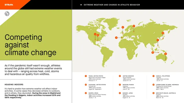
A data-driven infographic on climate change with a full-color world map pinpointing global climate impacts, flanked by earthy-toned panels of statistics and methodology.
Summary
A data-driven infographic on climate change with a full-color world map pinpointing global climate impacts, flanked by earthy-toned panels of statistics and methodology.
Visual description
Horizontal split layout: left panel (olive-green and cream background) holds a serif headline "Competing against climate change" in black, followed by introductory body text in small sans-serif and a "Heading Insights" section with bullet-point methodology. Right panel is a choropleth map of the world in olive-green with red and orange circular callouts marking climate-impact hotspots and regions. Below the map are three columns of orange-accented statistics cards with icons, numbers, and supporting text. The color palette unifies around olive-green and warm earthy tones (cream, rust, dark brown) to convey seriousness without panic. All typography is clean sans-serif in condensed weights for legibility at small scale.
Key takeaway
The choropleth-plus-callout-icons pattern for showing geographic data: color-codes regions by intensity, then overlays specific-location markers to guide focus. The left-right balance keeps introductory copy separate from the data visualization itself. Warm earthy tones + calm sans-serif hierarchy make a serious topic digestible.
Reuse notes
Essential for climate/ESG reporting, insurance/risk analytics, public-health messaging, and nonprofit annual reports. Works especially well when data is location-sensitive or spans multiple regions. Pair with short, clear copy on the left to contextualize the map on the right. Avoid using this layout if you need to show fewer than 4-5 data points (wastes the real estate).
More like this




Keep what you find
A free account saves references to boards and can send you a weekly email of picks based on what you save.
To see every result, go Pro.