Preview image. Unlock full-res
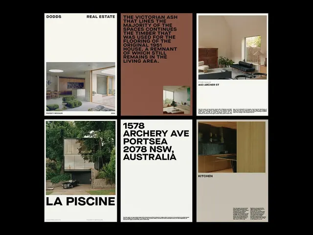
Real estate brochure combining property photography grid with bold typographic insets and warm neutral palette, framing architectural features alongside market copy.
Summary
A real estate brochure arranging property photography in a balanced grid punctuated by a warm-toned typographic panel that contextualizes the architectural history and materials of featured properties.
Visual description
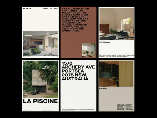
The layout uses a black background to isolate and frame each module, creating strong visual compartments. The top row arranges three equal-width elements: a "Property Brochure" interior photograph (2024) showing minimalist residential space with muted greens and wood details; a flush-left "Dodds Real Estate" title block in white and beige with date markers (May, Aug, Sept, Oct); and a product photograph of a burgundy kitchen interior with centered title "443 Archer St" and justified descriptive text below. The middle row repeats the pattern: a full-bleed exterior property photograph labeled "La Piscine" (pool area visible, framed by overgrown garden); a large-scale address heading "1578 Archery Ave Portsea 2078 NSW, Australia" in black sans-serif; and an interior kitchen detail shot. All photographs use warm natural light, wood tones, and architectural emphasis. The color palette oscillates between off-white card backgrounds, warm taupe, dark brown, and black borders. Small footnote text in gray provides property details and market context.
Key takeaway
The dramatic frame-and-reset structure: photography floats on black, creating visual breathing room between modules without traditional white margins. The typographic panel (the warm tan inset) interrupts the photographic rhythm, adding narrative weight and contextual storytelling without competing for visual attention. This is a proven editorial pattern for luxury real estate or high-end product brochures where heritage and material quality matter as much as the visual itself.
Reuse notes
Ideal for luxury real estate, architecture, interior design, or heritage-property marketing. The warm neutral palette (taupes, warm grays, burgundy wood) reads as premium and timeless. The grid is modular and scales; the black background isolates each property story. Avoid if properties lack strong architectural or natural-light qualities, as the framing expects quality imagery.
More like this



Keep what you find
A free account saves references to boards and can send you a weekly email of picks based on what you save.
To see every result, go Pro.