Preview image. Unlock full-res
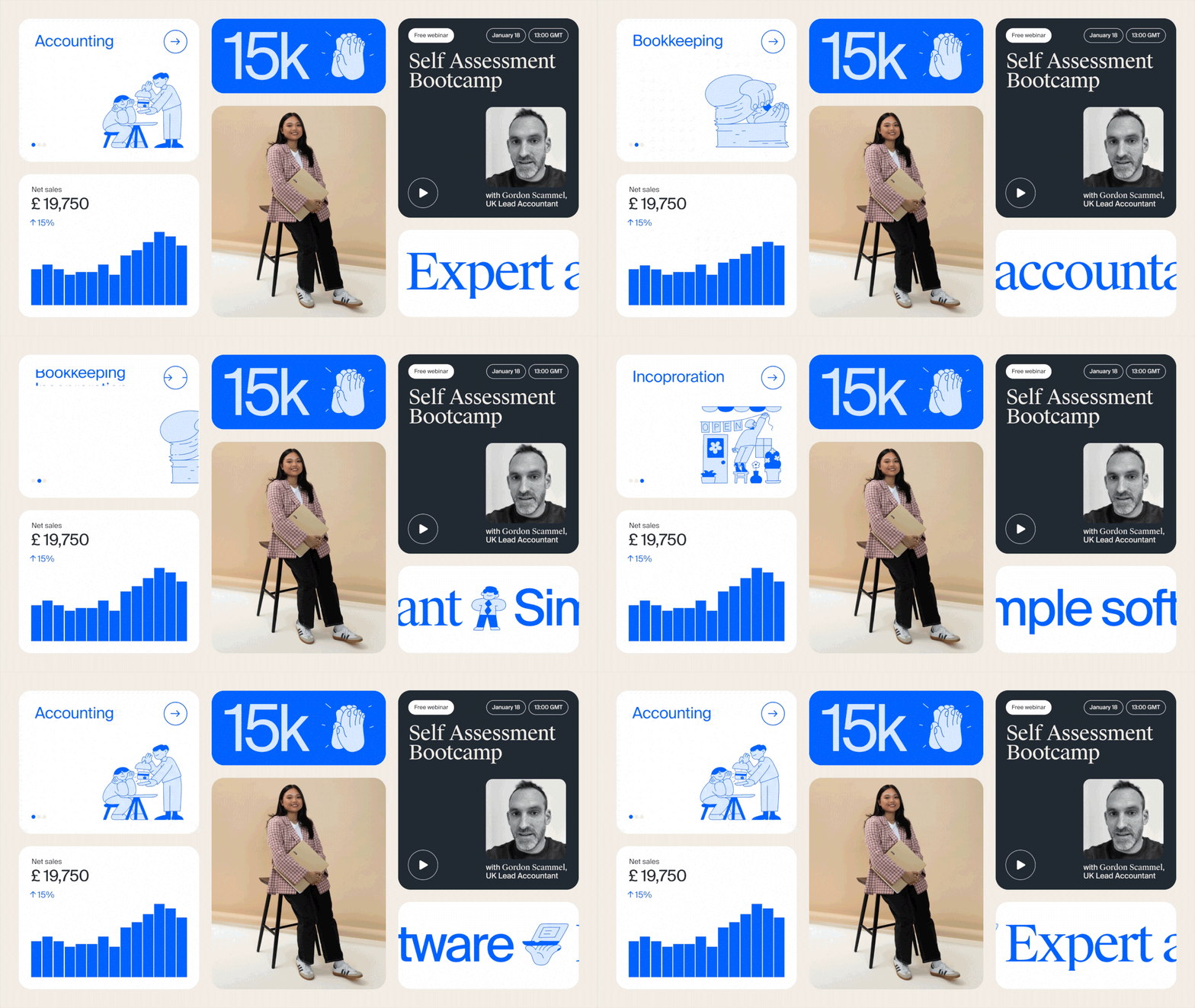
A responsive card-grid layout spanning accounting services, webinar promotion, and financial metrics in corporate blue, beige, and charcoal.
Summary
A three-column dashboard mixing service cards, webinar registration, and financial reporting, anchored by bright cobalt blue CTA and muted beige photography.
Visual description
Left column: white-background card labeled "Accounting" with blue line illustration of two people at a desk, and a small blue dot progress indicator. Center column: bright blue rounded banner showing "15k" with thumbs-up icon; below it, beige photo of woman in plaid holding portfolio on stool; financial metric card with "Net sales £19,750" (up 15%), topped by blue bar chart. Right column: dark charcoal card titled "Self Assessment Bootcamp" with webinar pills showing "Free webinar", "January 18", "13:00 GMT"; black-and-white portrait of instructor with play icon; partial blue text "Expert a..." below. Typography is clean sans-serif throughout.
Key takeaway
The three-column card system efficiently separates information hierarchy (service, promotion, results). Blue-white-beige-charcoal palette creates clear contrast without saturation. Beige photography grounds technical/financial content in human scale. Small illustrative elements (desk people, bar chart, thumbs-up) reinforce meaning without cluttering.
Reuse notes
Strong for fintech or accounting dashboards mixing product education, event promotion, and metrics. Responsive grid works across screen sizes. Blue works as primary CTA; beige warms otherwise cool technical palette. Avoid if you need more than three focal zones.
More like this



Keep what you find
A free account saves references to boards and can send you a weekly email of picks based on what you save.
To see every result, go Pro.